Jämför filtrerade data med råa läsningar
Vi tittar närmare på vilken skillnad läsningsfiltreringen gör. Här är ett diagram med tre olika täckningsspår. Uppifrån och ned visar de total täckning, täckning från högkvalitativa justeringar och täckning från lågkvalitativa justeringar.
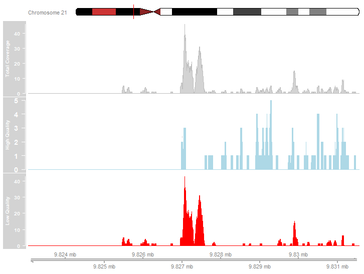
Granska diagrammet ovan. Vilka av följande påståenden beskriver korrekt de visade täckningsdata?
- De flesta läsningsjusteringar var av hög kvalitet.
- De mest utpräglade topparna beror på lågkvalitativa justeringar.
- Det finns toppar i den högkvalitativa täckningsprofilen.
Den här övningen är en del av kursen
ChIP-seq med Bioconductor i R
Interaktiv övning med praktiskt arbete
Gör teori till handling med en av våra interaktiva övningar
 Starta övningen