Compare dados filtrados com leituras brutas
Vamos olhar mais de perto a diferença que o filtro de leituras faz. Aqui está um gráfico com três trilhas de cobertura diferentes. De cima para baixo, elas mostram a cobertura total, a cobertura de alinhamentos de alta qualidade e a cobertura de alinhamentos de baixa qualidade.
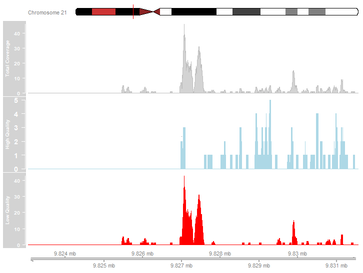
Examine o gráfico acima. Quais das afirmações a seguir descrevem com precisão os dados de cobertura mostrados?
- A maioria dos alinhamentos de leituras foi de alta qualidade.
- Os picos mais pronunciados são devidos a alinhamentos de baixa qualidade.
- Há picos no perfil de cobertura de alta qualidade.
Este exercicio faz parte do curso
ChIP-seq com Bioconductor em R
exercicio interativo prático
Transforme teoria em prática com um dos nossos exercicio interativos
 Iniciar exercicio