Süzülmüş veriyi ham okumalarla karşılaştır
Okuma süzmenin yarattığı farkı daha yakından inceleyelim. Burada üç farklı kapsama izinin olduğu bir grafik var. Yukarıdan aşağıya sırasıyla toplam kapsama, yüksek kaliteli hizalamalardan gelen kapsama ve düşük kaliteli hizalamalardan gelen kapsama gösteriliyor.
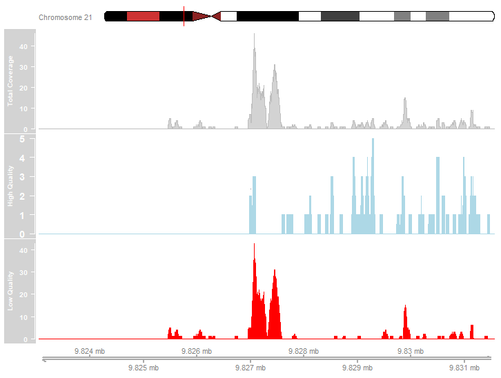
Yukarıdaki grafiği incele. Aşağıdaki ifadelerden hangileri gösterilen kapsama verisini doğru tanımlıyor?
- Okuma hizalamalarının çoğu yüksek kaliteliydi.
- En belirgin tepeler düşük kaliteli hizalamalardan kaynaklanıyor.
- Yüksek kaliteli kapsama profilinde tepeler var.
Bu egzersiz, kursun bir parçasıdır
R ile Bioconductor kullanarak ChIP-seq
Uygulamalı etkileşimli egzersiz
Teoriyi etkileşime dönüştürün, interaktif egzersizlerimizden biriyle
 Egzersize başla