在資料上繪製模型
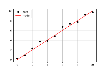
延續前一個練習使用的量測資料,你的目標是利用已定義的 model() 以及量測資料 times 和 measured_distances 計算模型預測的距離,然後在同一個座標軸上同時繪出量測與模型的資料。
本練習屬於課程
Python 線性建模入門
練習說明
- 使用
model_distances = model(times, measured_distances)計算模型數值。 - 使用
plt.subplots()建立圖形與座標軸物件。 - 使用
axis.plot()以選項linestyle=" ", marker="o", color="black"繪製times對measured_distances。 - 使用
axis.plot()也以選項linestyle="-", color="red"繪製times對model_distances。
動手互動練習
試著完成這個範例程式碼,體驗一下這個練習。
# Pass times and measured distances into model
model_distances = model(____, ____)

# Create figure and axis objects and call axis.plot() twice to plot data and model distances versus times
fig, axis = plt.subplots()
axis.plot(____, ____, linestyle="____", marker="____", color="____", label="Measured")
axis.plot(____, ____, linestyle="____", marker=None, color="____", label="Modeled")

# Add grid lines and a legend to your plot, and then show to display
axis.grid(True)
axis.legend(loc="best")
plt.show()