繪製資料
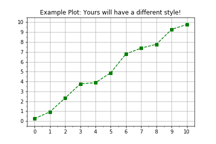
在 Python 中,萬物皆為物件,模組也不例外。這題的目標是複習如何使用物件導向介面操作 Python 的 matplotlib 函式庫,讓你以更彈性、可延伸的流程來視覺化量測資料。一般的繪圖流程如下:
import matplotlib.pyplot as plt
fig, axis = plt.subplots()
axis.plot(x, y, color="green", linestyle="--", marker="s")
plt.show()
本練習屬於課程
Python 線性建模入門
練習說明
- 使用
plt.subplots()建立 figure 與 axis 物件。 - 已提供兩個預先定義的
numpy陣列times與distances作為資料。 - 使用
axis.plot()將times畫在水平軸、distances畫在垂直軸。 - 呼叫
axis.plot()時,請使用關鍵字引數linestyle=" "、marker="o",以及color="red"。
動手互動練習
試著完成這個範例程式碼,體驗一下這個練習。
# Create figure and axis objects using subplots()
fig, axis = plt.____()

# Plot line using the axis.plot() method
line = axis.plot(____ , ____ , linestyle="____", marker="____", color="____")

# Use the plt.show() method to display the figure
plt.____()