Compare filtered data to raw reads
Let's take a closer look at the difference the read filtering makes. Here is a plot with three different coverage tracks. From top to bottom they show total coverage, coverage from high-quality alignments, and coverage from low-quality alignments.
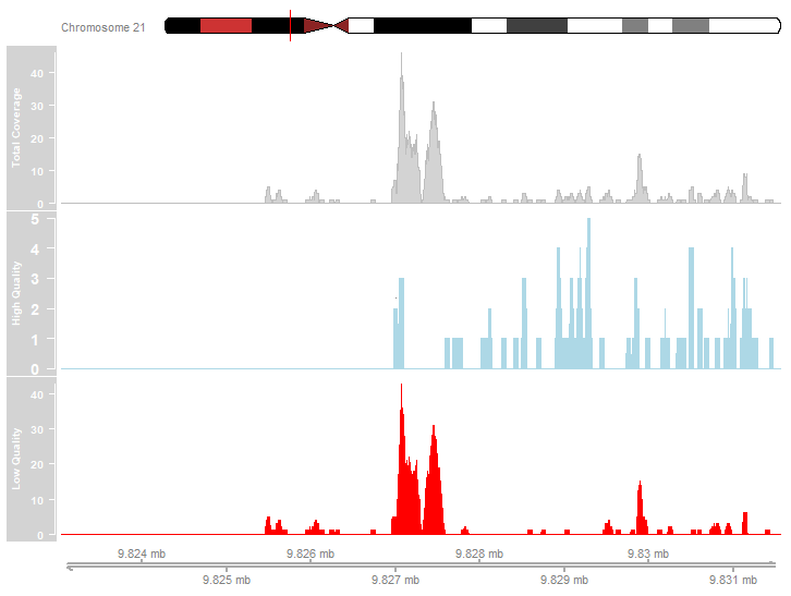
Examine the plot above. Which of the following statements accurately describe the depicted coverage data?
- Most read alignments were of high quality.
- The most pronounced peaks are due to low-quality alignments.
- There are peaks in the high-quality coverage profile.
Deze oefening maakt deel uit van de cursus
ChIP-seq with Bioconductor in R
Interactieve oefening met praktijkervaring
Zet theorie om in actie met een van onze interactieve oefeningen
 Begin oefening