データ上にモデルをプロットする
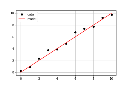
前の演習と同じ実測データを使います。あらかじめ定義された model() と、実測データである times と measured_distances を用いてモデル化した距離を計算し、実測データとモデル化データを同じ座標軸上にプロットしてください。
この演習はコースの一部です
Pythonで学ぶ線形モデリング入門
演習の手順
model_distances = model(times, measured_distances)を使ってモデル値を計算します。plt.subplots()を使って figure と axis オブジェクトを作成します。axis.plot()を使って、timesとmeasured_distancesをlinestyle=" ", marker="o", color="black"のオプションでプロットします。axis.plot()を使って、timesとmodel_distancesもlinestyle="-", color="red"のオプションでプロットします。
実践的なインタラクティブ演習
このサンプルコードを完成させて、この演習に挑戦してみましょう。
# Pass times and measured distances into model
model_distances = model(____, ____)

# Create figure and axis objects and call axis.plot() twice to plot data and model distances versus times
fig, axis = plt.subplots()
axis.plot(____, ____, linestyle="____", marker="____", color="____", label="Measured")
axis.plot(____, ____, linestyle="____", marker=None, color="____", label="Modeled")

# Add grid lines and a legend to your plot, and then show to display
axis.grid(True)
axis.legend(loc="best")
plt.show()