データのプロット
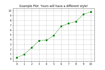
Python ではモジュールも含めて、すべてがオブジェクトです。この演習では、測定データをより柔軟かつ拡張しやすいワークフローで可視化するために、Python ライブラリ matplotlib のオブジェクト指向インターフェースの使い方を復習します。一般的なプロットのワークフローは次のとおりです。
import matplotlib.pyplot as plt
fig, axis = plt.subplots()
axis.plot(x, y, color="green", linestyle="--", marker="s")
plt.show()
この演習はコースの一部です
Pythonで学ぶ線形モデリング入門
演習の手順
plt.subplots()を使って figure と axis オブジェクトを作成します。- データは、事前定義された 2 つの
numpy配列timesとdistancesに用意されています。 axis.plot()を使って、横軸にtimes、縦軸にdistancesをプロットします。axis.plot()を呼び出すとき、キーワード引数linestyle=" "、marker="o"、color="red"を指定します。
実践的なインタラクティブ演習
このサンプルコードを完成させて、この演習に挑戦してみましょう。
# Create figure and axis objects using subplots()
fig, axis = plt.____()

# Plot line using the axis.plot() method
line = axis.plot(____ , ____ , linestyle="____", marker="____", color="____")

# Use the plt.show() method to display the figure
plt.____()