Das Modell auf die Daten plotten
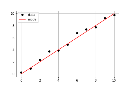
Mit den gleichen Messdaten wie in der vorherigen Übung sollst du ein vordefiniertes model() sowie die gemessenen Daten times und measured_distances verwenden, um modellierte Distanzen zu berechnen und anschließend sowohl die gemessenen als auch die modellierten Daten in derselben Achse zu plotten.
Diese Übung ist Teil des Kurses
<Kurs>Einführung in lineares Modellieren mit Python</Kurs>Übungsanweisungen
- Verwende
model_distances = model(times, measured_distances), um die modellierten Werte zu berechnen. - Verwende
plt.subplots(), um Figure- und Achsenobjekte zu erzeugen. - Nutze
axis.plot(), umtimesgegenmeasured_distanceszu plotten, mit den Optionenlinestyle=" ", marker="o", color="black". - Nutze
axis.plot()außerdem, umtimesgegenmodel_distancesmit den Optionenlinestyle="-", color="red"zu plotten.
Interaktive praktische Übung
Versuche dich an dieser Übung, indem du diesen Beispielcode vervollständigst.
# Pass times and measured distances into model
model_distances = model(____, ____)

# Create figure and axis objects and call axis.plot() twice to plot data and model distances versus times
fig, axis = plt.subplots()
axis.plot(____, ____, linestyle="____", marker="____", color="____", label="Measured")
axis.plot(____, ____, linestyle="____", marker=None, color="____", label="Modeled")

# Add grid lines and a legend to your plot, and then show to display
axis.grid(True)
axis.legend(loc="best")
plt.show()