Bootstrap visualisieren
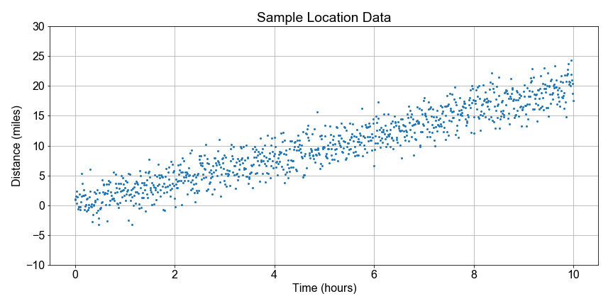
Wir knüpfen an den früheren Stand in dieser Lektion an und visualisieren die Bootstrap-Verteilung der Geschwindigkeiten, die per Bootstrap-Resampling geschätzt wurden. Dabei haben wir für jede Stichprobe eine Ausgleichsgerade (Least Squares) für die Steigung berechnet, um die Variation bzw. Unsicherheit unserer Steigungsschätzung zu testen.
Zum Einstieg haben wir die Funktion compute_resample_speeds(distances, times) vorab geladen. Sie übernimmt die Berechnung und erzeugt die Stichprobenverteilung der Geschwindigkeit.
Diese Übung ist Teil des Kurses
<Kurs>Einführung in lineares Modellieren mit Python</Kurs>Übungsanweisungen
- Verwende die vordefinierte Funktion
compute_resample_speeds(distances, times), um dieresample_speedszu berechnen. - Verwende
np.mean(), um diespeed_estimateaus denresample_speedszu bestimmen. - Verwende
np.percentile()mit[5, 95], um diepercentilesderresample_speedszu berechnen, die die Grenzen des Konfidenzintervalls definieren. - Verwende
axis.hist(), um dieresample_speedszu plotten, und gib die Bins mithist_bin_edgesan. - Verwende
axis.axvlineund gib die richtigen zwei Indizes vonpercentilesan, um die Grenzen des Konfidenzintervalls im Diagramm zu markieren.
Interaktive praktische Übung
Versuche dich an dieser Übung, indem du diesen Beispielcode vervollständigst.
# Create the bootstrap distribution of speeds
resample_speeds = compute_resample_speeds(____, ____)
speed_estimate = np.mean(____)
percentiles = np.percentile(____, [5, 95])

# Plot the histogram with the estimate and confidence interval
fig, axis = plt.subplots()
hist_bin_edges = np.linspace(0.0, 4.0, 21)
axis.hist(____, ____, color='green', alpha=0.35, rwidth=0.8)
axis.axvline(speed_estimate, label='Estimate', color='black')
axis.axvline(percentiles[____], label=' 5th', color='blue')
axis.axvline(percentiles[____], label='95th', color='blue')
axis.legend()
plt.show()