Comparer les données filtrées aux lectures brutes
Examinons de plus près l’effet du filtrage des lectures. Voici un graphique avec trois pistes de couverture. De haut en bas, elles montrent la couverture totale, la couverture provenant d’alignements de haute qualité et la couverture provenant d’alignements de faible qualité.
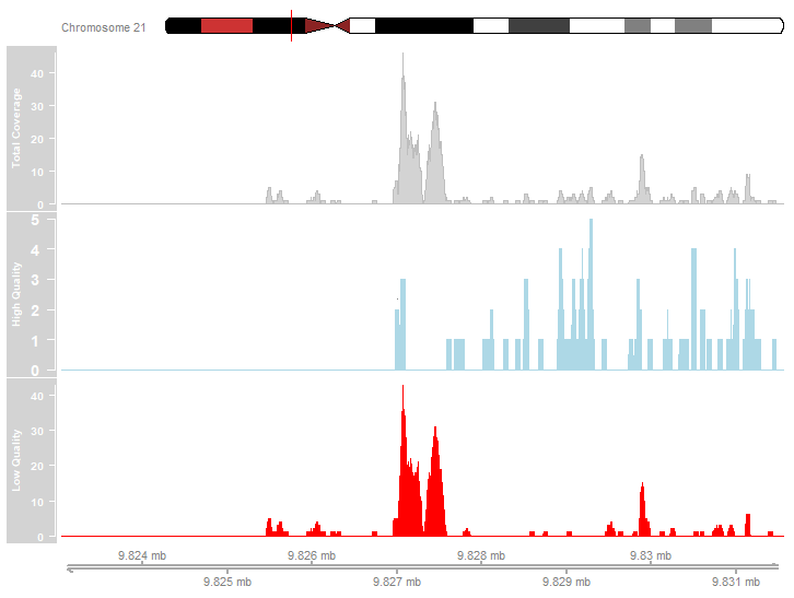
Étudiez le graphique ci-dessus. Lesquelles des affirmations suivantes décrivent fidèlement les données de couverture représentées ?
- La plupart des alignements de lectures étaient de haute qualité.
- Les pics les plus prononcés sont dus à des alignements de faible qualité.
- Il existe des pics dans le profil de couverture de haute qualité.
Cet exercice fait partie du cours
<cours>ChIP-seq avec Bioconductor en R</cours>Exercice interactif pratique
Transformez la théorie en action avec l’un de nos exercices interactifs
 Commencer l’exercice