Confronta i dati filtrati con i read grezzi
Vediamo più da vicino la differenza introdotta dal filtraggio dei read. Qui trovi un grafico con tre diverse tracce di coverage. Dall’alto verso il basso mostrano la coverage totale, la coverage dagli allineamenti di alta qualità e la coverage dagli allineamenti di bassa qualità.
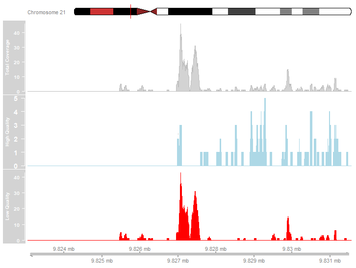
Esamina il grafico qui sopra. Quali delle seguenti affermazioni descrivono correttamente i dati di coverage mostrati?
- La maggior parte degli allineamenti dei read era di alta qualità.
- I picchi più pronunciati sono dovuti ad allineamenti di bassa qualità.
- Nel profilo di coverage di alta qualità sono presenti dei picchi.
Questo esercizio fa parte del corso
ChIP-seq con Bioconductor in R
esercizio interattivo pratico
Trasforma la teoria in pratica con uno dei nostri esercizi interattivi
 Inizia esercizio