色でエンコードする変数を正しく選ぶ
ロングビーチと周辺都市の汚染値を時系列で可視化します。提供されたコードは下図(読みにくいプロット)を作成しており、最大汚染値(max_pollutant_values)を都市ごとの色分けで棒グラフにしています。
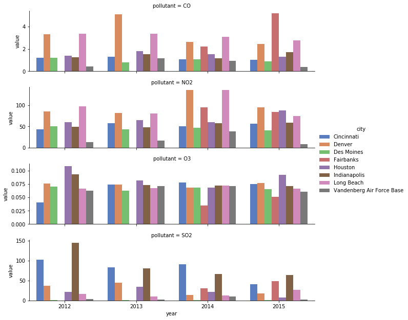
少し手を加えるだけで、すぐに見やすくできます。まず、表示する都市を国内の西側の都市のみに絞ることで、煩雑さを避けられます。次に、色のエンコーディングを city から year に入れ替えると、序数パレットを使えるようになり、読者が凡例で「どの色がどの都市か」を何度も確認する必要がなくなります。
この演習はコースの一部です
Pythonでデータ可視化を磨く
演習の手順
citiesベクトルから'Indianapolis'、'Des Moines'、'Cincinnati'、'Houston'を削除します。cityとyear変数のエンコーディングを入れ替えます。- 新たに序数変数となった色分けに合わせて、ColorBrewer の
'BuGn'パレットを使用します。
実践的なインタラクティブ演習
このサンプルコードを完成させて、この演習に挑戦してみましょう。
# Reduce to just cities in the western half of US
cities = ['Fairbanks', 'Long Beach', 'Vandenberg Air Force Base', 'Denver',
          'Indianapolis', 'Des Moines', 'Cincinnati', 'Houston']

# Filter data to desired cities
city_maxes = max_pollutant_values[max_pollutant_values.city.isin(cities)]

# Swap city and year encodings
sns.catplot(x = 'year', hue = 'city',
              y = 'value', row = 'pollutant',
              # Change palette to one appropriate for ordinal categories
              data = city_maxes, palette = 'muted',
              sharey = False, kind = 'bar')
plt.show()