Interpreting line plots
Line plots are excellent for comparing two continuous variables, where consecutive observations are connected somehow. A common type of line plot is to have dates or times on the x-axis, and a numeric quantity on the y-axis. In this case, "consecutive observations" means values on successive dates, like today and tomorrow. By drawing multiple lines on the same plot, you can compare values.
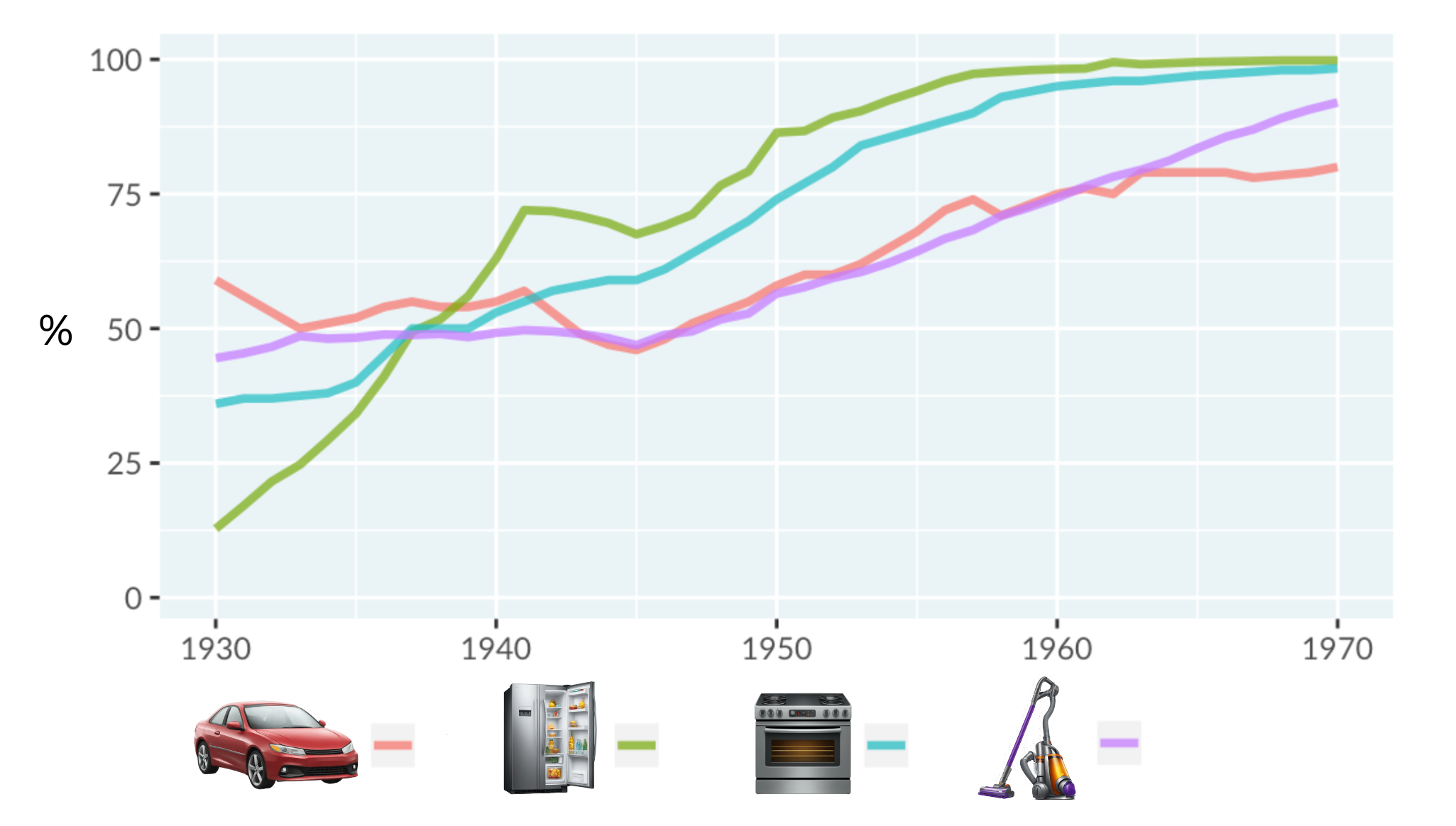
The following line plot shows the percentage of households in the United States that adopted each of four technologies (automobiles, refrigerators, stoves, and vacuums) from 1930 to 1970. The x-axis represents the years, while the y-axis represents % adoption (how many households had adopted each technology at a given time). Each colored line corresponds to a different technology.
Data source: Hannah Ritchie and Max Roser (2019) - Technology Adoption
This exercise is part of the course
Understanding Data Visualization
Hands-on interactive exercise
Turn theory into action with one of our interactive exercises
 Start Exercise