Interpreting scatter plots
Scatter plots let you explore the relationship between two continuous variables.
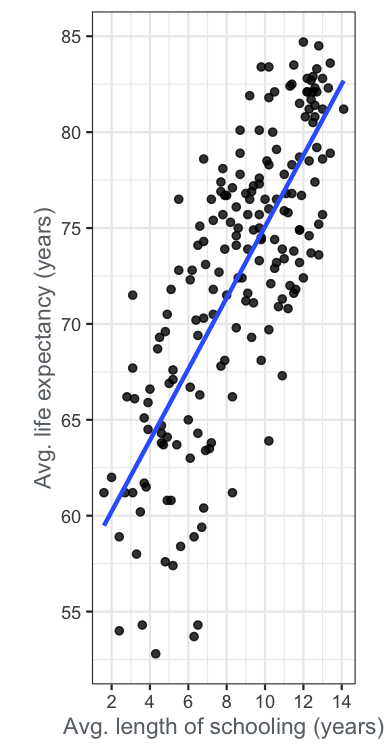
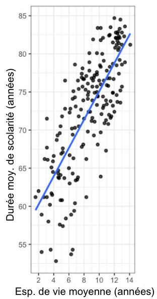
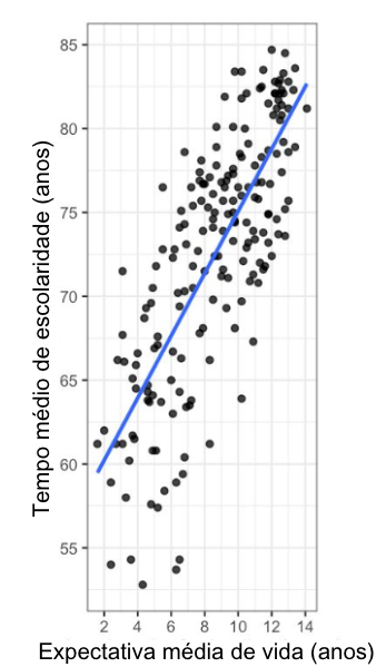
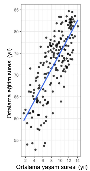
Here you can see a scatter plot of average life expectancy (on the y-axis) versus average length of schooling (on the x-axis) for countries around the world. Each point in the plot represents one country. A straight trend line from a linear regression model is shown.
View translated version: IT | DE | ES | FR | PT-BR | TR
Data source: United Nations
This exercise is part of the course
Understanding Data Visualization
Hands-on interactive exercise
Turn theory into action with one of our interactive exercises
 Start Exercise