Interpreting dot plots
Dot plots are similar to bar plots in that they show a numeric metric for each category of a categorical variable. They have two advantages over bar plots: you can use a log scale for the metric, and you can display more than one metric per category.
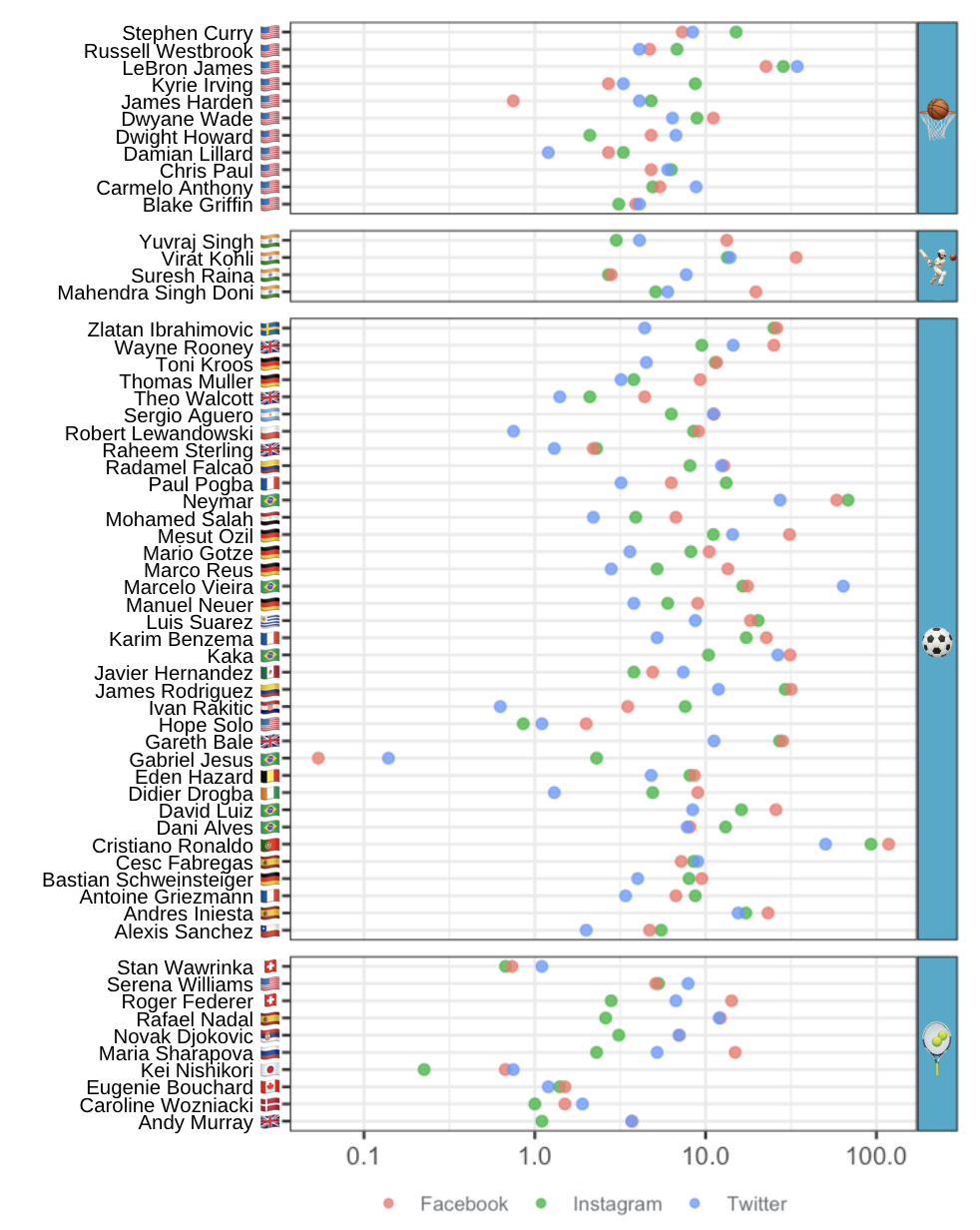
Here is a dot plot of the social media followings of the ESPN 2017 top 100 famous athletes, with one row per athlete. Three metrics are shown for each athlete: the number of followers on Facebook, Instagram, and Twitter. Only the athletes for Basketball, Cricket, Soccer, and Tennis who had accounts on each platform are shown. Rows are sorted alphabetically for each sport.
Based on the plot, which statement about the athlete's social media following is false?
This exercise is part of the course
Understanding Data Visualization
Hands-on interactive exercise
Turn theory into action with one of our interactive exercises
 Start Exercise