Interpreting box plots
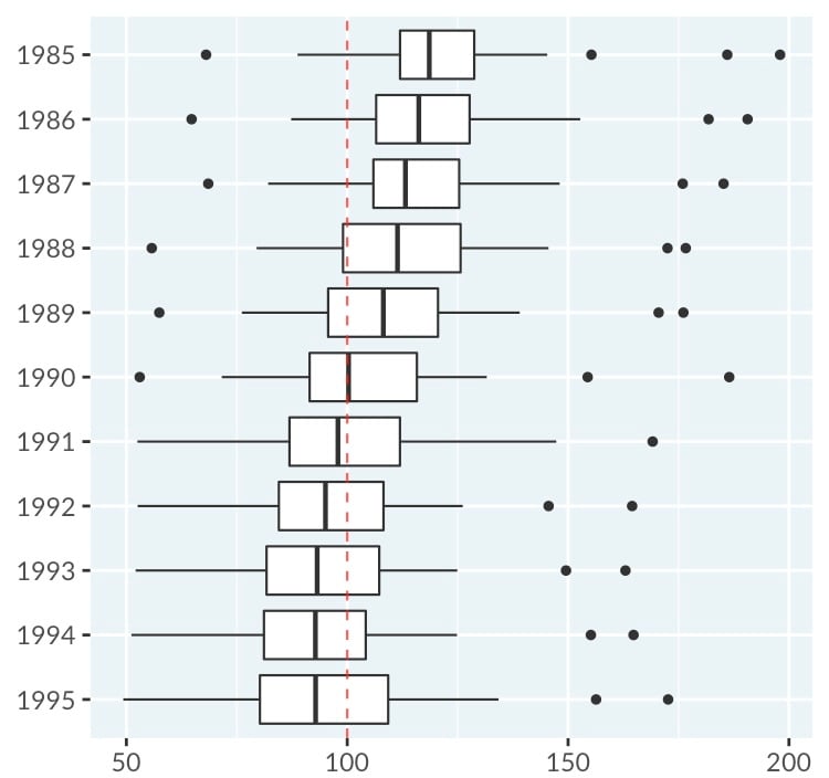
Here are box plots of cigarette consumption per person in the USA from 1985 to 1995 (Alaska and Hawaii are not included). Each observation in the dataset is the average number of packets of cigarette smoked per person in one state in one year. Thus each box plot represents the distribution of 48 data points (because there are 48 US states included in the dataset). The years are on the y-axis, and the amount of cigarettes packs smoked (per capita per year) are on the x-axis.
Data Source: Stock, James H. and Mark W. Watson (2003)
This exercise is part of the course
Understanding Data Visualization
Hands-on interactive exercise
Turn theory into action with one of our interactive exercises
 Start Exercise