Interpreting histograms
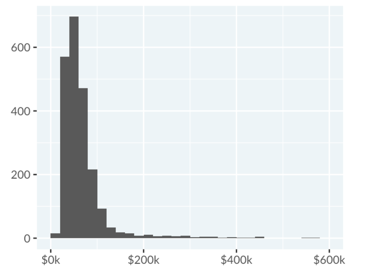
The histogram below displays the distribution of average taxable income for various jobs in Australia. The x-axis represents the average taxable income (AUD/year), showing salary ranges. The y-axis represents the count of jobs in each income range.
Tip: This left-hand pane of the exercise containing text and instructions is resizable. If the plot is too small to see clearly, making the pane wider will increase the plot size. Move your mouse in-between the left-hand pane and the drag and drop portion of the exercise so a gray vertical bar appears. In Chrome, click and drag this bar to the right. In Firefox, click the bar, move your mouse right, then click again.
Data Source: Tidy Tuesday
This exercise is part of the course
Understanding Data Visualization
Hands-on interactive exercise
Turn theory into action with one of our interactive exercises
 Start Exercise