Interpreting pair plots
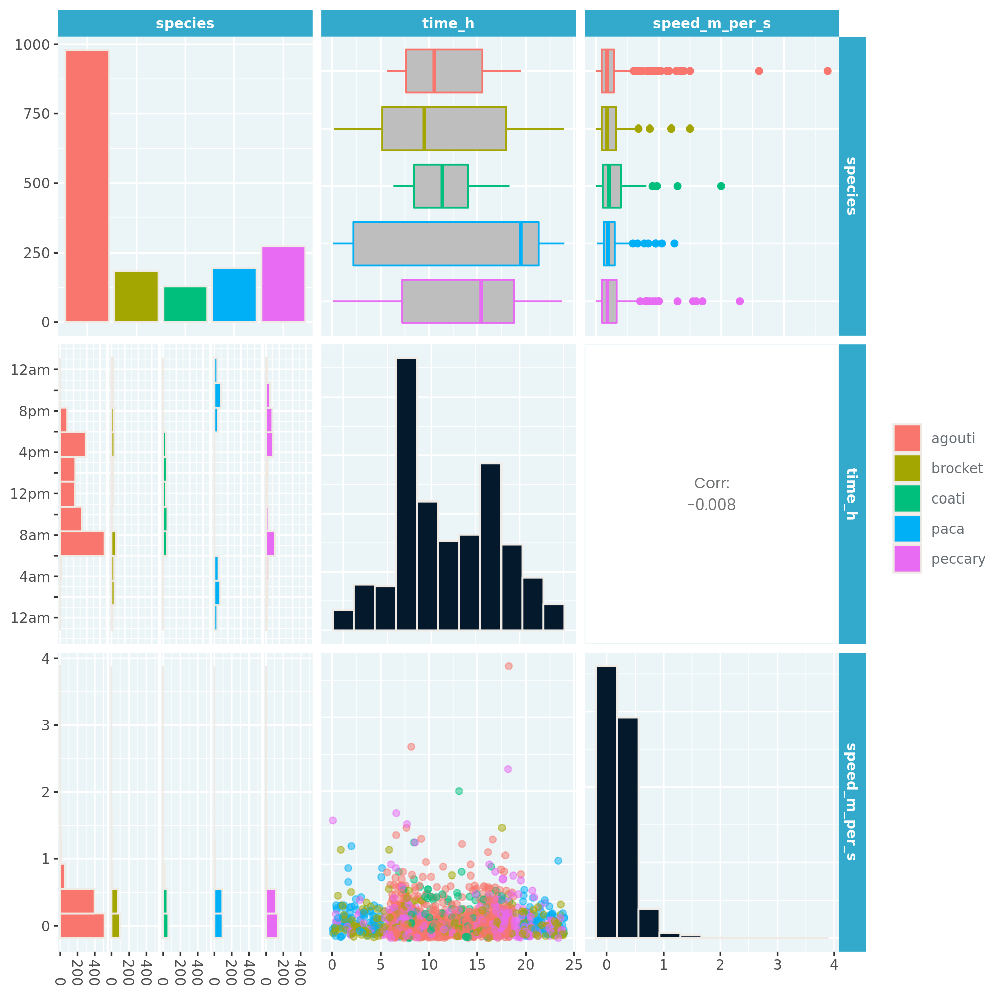
To get a quick overview of a dataset, it's really helpful to draw a plot of the distribution of each variable, and the relationship between each pair of variables. A pair plot displays all these plots together in a matrix of panels. It shows a lot of information at once, so to interpret it, try looking at one panel at a time.
Here you can see the Panamanian camera trap data for the agouti and paca, as well as three new species: coati, brocket, and peccary.
This exercise is part of the course
Understanding Data Visualization
Hands-on interactive exercise
Turn theory into action with one of our interactive exercises
 Start Exercise