探索各菜系:代表性食材(進階版)
每一種菜系之所以有其獨特風味,往往來自少數幾種具代表性的食材。若只看最常見的食材,我們只會抓到像鹽或糖這類日常調味,無法凸顯差異。
另一個能幫上忙的指標是詞頻—逆文件頻率(term frequency–inverse document frequency,TFIDF)。它是一種數值統計,用來衡量某個詞(這裡是食材)在某份文件(菜系)相對於整個文件集(食譜)的重要程度。
我們已經幫你預先計算好 tf_idf,並建立了一個名為 recipes_enriched 的增補資料集。你的目標是建立一個 Shiny 應用程式,依 tf_idf 顯示某菜系中最具代表性的食材,並以水平長條圖呈現。
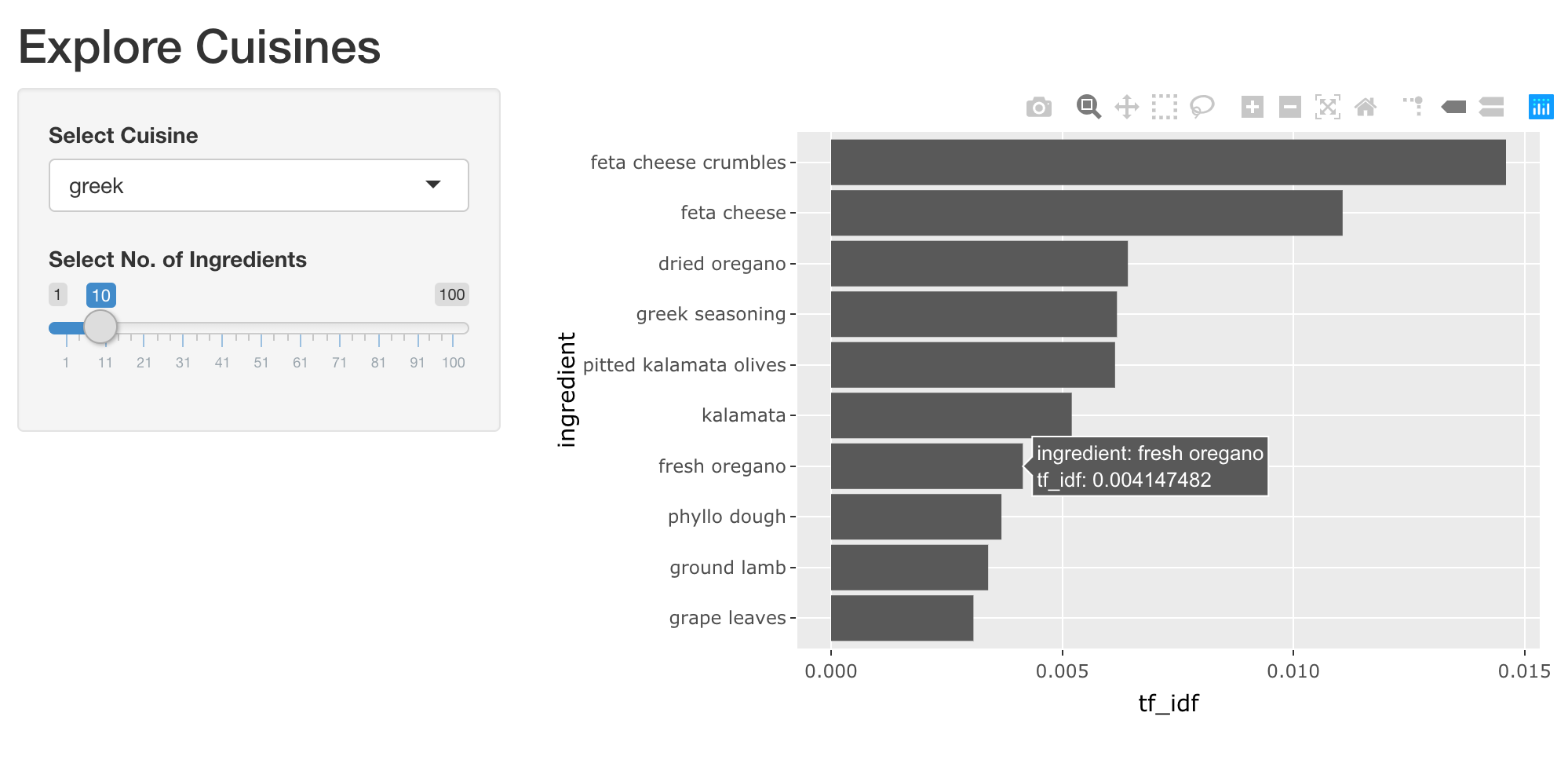
你將使用 reactive 運算式來封裝計算,讓作圖程式碼只專注於產生圖表。這是良好的程式撰寫實務,有助於建立模組化且效能良好的 Shiny 應用。
我們已載入 shiny、dplyr、ggplot2 與 plotly 套件。下面提供兩段實用範例,示範如何依菜系篩出前幾名食材,並繪製水平長條圖。你可以視需要調整。
top_ingredients <- recipes_enriched %>%
  filter(cuisine == 'greek') %>%
  arrange(desc(tf_idf)) %>%
  head(5)

ggplot(top_ingredients, aes(x = ingredient, y = tf_idf)) +
  geom_col() +
  coord_flip()
本練習屬於課程
使用 R 的 Shiny 建立網頁應用程式
練習說明
UI:
- 加入一個名為
plot_top_ingredients的互動式 plotly 輸出,並以tabPanel()包起來,給予合適的標籤。
- 加入一個名為
Server:
- 新增名為
rval_top_ingredients的 reactive 運算式, 依所選菜系從recipes_enriched篩選出食材,並依tf_idf取得最具代表性的前幾項。 - 繪製互動式的食材長條圖,呈現食材與其
tf_idf,並指定輸出為plot_top_ingredients。 想挑戰自己,可以嘗試讓長條依tf_idf由高到低排序顯示。
- 新增名為
動手互動練習
試著完成這個範例程式碼,體驗一下這個練習。
ui <- fluidPage(
  titlePanel('Explore Cuisines'),
  sidebarLayout(
    sidebarPanel(
      selectInput('cuisine', 'Select Cuisine', unique(recipes$cuisine)),
      sliderInput('nb_ingredients', 'Select No. of Ingredients', 1, 100, 10),
    ),
    mainPanel(
      tabsetPanel(
        # CODE BELOW: Add a plotly output named "plot_top_ingredients"

        tabPanel('Table', DT::DTOutput('dt_top_ingredients'))
      )
    )
  )
)

server <- function(input, output, session) {
  # CODE BELOW: Add a reactive expression named `rval_top_ingredients` that
  # filters `recipes_enriched` for the selected cuisine and top ingredients
  # based on the tf_idf value.


  # CODE BELOW: Render a horizontal bar plot of top ingredients and
  # the tf_idf of recipes they get used in, and assign it to an output named
  # `plot_top_ingredients`


  output$dt_top_ingredients <- DT::renderDT({
    recipes %>%
      filter(cuisine == input$cuisine) %>%
      count(ingredient, name = 'nb_recipes') %>%
      arrange(desc(nb_recipes)) %>%
      head(input$nb_ingredients)
  })
}

shinyApp(ui, server)