แสดงภาพ Bootstrap
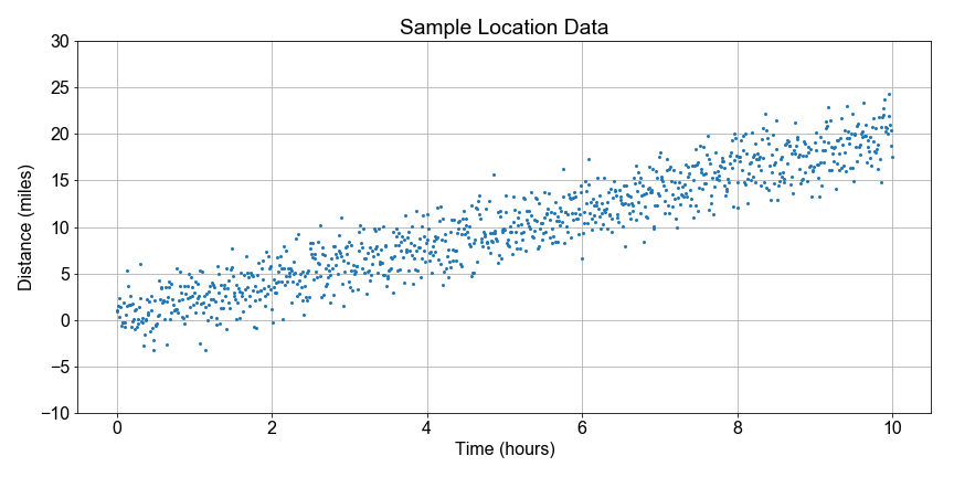
ต่อจากที่ทำค้างไว้ก่อนหน้าในบทเรียนนี้ มาแสดงภาพการกระจายตัวแบบ Bootstrap ของค่าความเร็วที่ประมาณได้จากการสุ่มตัวอย่างแบบ Bootstrap กัน โดยเราได้คำนวณค่า Least-Squares Fit ของ Slope สำหรับทุกตัวอย่าง เพื่อทดสอบความแปรปรวนหรือความไม่แน่นอนในการประมาณค่า Slope
เพื่อให้เริ่มต้นได้ทันที มีฟังก์ชัน compute_resample_speeds(distances, times) โหลดไว้ให้แล้ว สำหรับการคำนวณและสร้างการกระจายตัวของตัวอย่างความเร็ว
แบบฝึกหัดนี้เป็นส่วนหนึ่งของหลักสูตร
Introduction to Linear Modeling in Python
คำแนะนำการฝึกหัด
- ใช้ฟังก์ชัน
compute_resample_speeds(distances, times)ที่กำหนดไว้แล้วเพื่อคำนวณresample_speeds - ใช้
np.mean()เพื่อคำนวณspeed_estimateจากresample_speeds - ใช้
np.percentile()พร้อมค่า[5, 95]เพื่อคำนวณpercentilesของresample_speedsซึ่งกำหนดขอบเขตของช่วงความเชื่อมั่น - ใช้
axis.hist()เพื่อพล็อตresample_speedsโดยระบุ Bin ด้วยhist_bin_edges - ใช้
axis.axvlineระบุ Index ที่ถูกต้องทั้ง สอง ค่าของpercentilesเพื่อทำเครื่องหมายขอบเขตของช่วงความเชื่อมั่นบนกราฟ
แบบฝึกหัดเชิงโต้ตอบแบบลงมือทำ
ลองทำแบบฝึกหัดนี้โดยเติมโค้ดตัวอย่างนี้ให้สมบูรณ์
# Create the bootstrap distribution of speeds
resample_speeds = compute_resample_speeds(____, ____)
speed_estimate = np.mean(____)
percentiles = np.percentile(____, [5, 95])

# Plot the histogram with the estimate and confidence interval
fig, axis = plt.subplots()
hist_bin_edges = np.linspace(0.0, 4.0, 21)
axis.hist(____, ____, color='green', alpha=0.35, rwidth=0.8)
axis.axvline(speed_estimate, label='Estimate', color='black')
axis.axvline(percentiles[____], label=' 5th', color='blue')
axis.axvline(percentiles[____], label='95th', color='blue')
axis.legend()
plt.show()