데이터 그리기
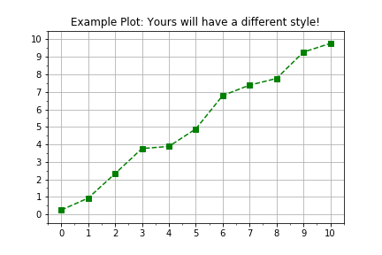
Python에서는 모듈까지 포함해 모든 것이 객체예요. 이 연습 문제의 목표는 측정된 데이터를 더 유연하고 확장 가능한 작업 흐름으로 시각화하기 위해, Python 라이브러리 matplotlib의 객체 지향 인터페이스 사용법을 복습하는 거예요. 일반적인 그리기 작업 흐름은 다음과 같습니다:
import matplotlib.pyplot as plt
fig, axis = plt.subplots()
axis.plot(x, y, color="green", linestyle="--", marker="s")
plt.show()
이 연습은 강의의 일부입니다
Python으로 배우는 선형 모델 입문
연습 안내
plt.subplots()를 사용해 figure와 axis 객체를 생성하세요.- 데이터는 미리 정의된 두 개의
numpy배열times와distances로 제공됩니다. axis.plot()을 사용해 가로축에는times, 세로축에는distances를 그리세요.axis.plot()을 호출할 때 입력 키워드 인수linestyle=" ",marker="o",color="red"를 사용하세요.
실습형 인터랙티브 연습
이 예제를 이 샘플 코드를 완성하여 풀어보세요.
# Create figure and axis objects using subplots()
fig, axis = plt.____()

# Plot line using the axis.plot() method
line = axis.plot(____ , ____ , linestyle="____", marker="____", color="____")

# Use the plt.show() method to display the figure
plt.____()