アプリ 3: 人気の赤ちゃんの名前 Redux
すばらしいです!人気の赤ちゃんの名前を縦棒グラフで表示するアプリ作りは楽しめましたか。ここでは、これまでに作ったアプリを拡張し、トップ10の名前を表示するテーブルをタブとして追加して、この章を締めくくります。最終的なアプリは、下のスクリーンショットのような見た目になります。
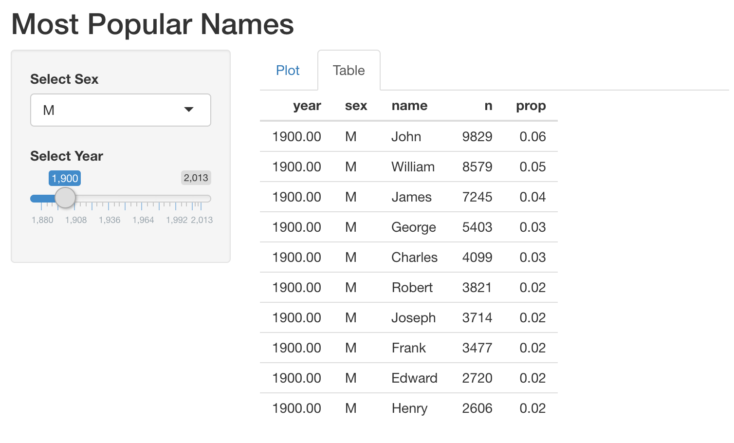
指定した year と sex に対してトップ10の名前を取り出す関数 get_top_names() を用意しています。たとえば 2000 年の男性名のトップ10は、get_top_names(2000, "M") で取得できます。
この演習はコースの一部です
Rで作るShiny Webアプリケーション
演習の手順
- 提供されたコードは、前の演習で作成したアプリのものです。人気の名前を表示するテーブル出力をサーバーに追加するように、このコードを修正してください。
- UI では、グラフとテーブルの出力をタブとして配置してください。
実践的なインタラクティブ演習
このサンプルコードを完成させて、この演習に挑戦してみましょう。
# MODIFY this app (built in the previous exercise)
ui <- fluidPage(
  titlePanel("Most Popular Names"),
  sidebarLayout(
    sidebarPanel(
      selectInput('sex', 'Select Sex', c("M", "F")),
      sliderInput('year', 'Select Year', min = 1880, max = 2017, value = 1900)
    ),
    mainPanel(
     plotOutput('plot')
    )
  )
)

server <- function(input, output, session) {
  output$plot <- renderPlot({
    top_names_by_sex_year <- get_top_names(input$year, input$sex)
    ggplot(top_names_by_sex_year, aes(x = name, y = prop)) +
      geom_col()
  })
}

shinyApp(ui = ui, server = server)