タブレイアウト
同じページに複数の表やプロットを表示すると、視覚的にごちゃつき、アプリの利用者の注意が散漫になってしまいます。そんなときに便利なのがタブレイアウトです。異なる出力をタブとして分けて表示できます。
この演習では、前回の演習で使ったサイドバーのレイアウトの Shiny アプリを出発点として、タブを使うように修正します。少しのコード変更でアプリのレイアウトを簡単に切り替えられることが、Shiny ではとても明確にわかるはずです。
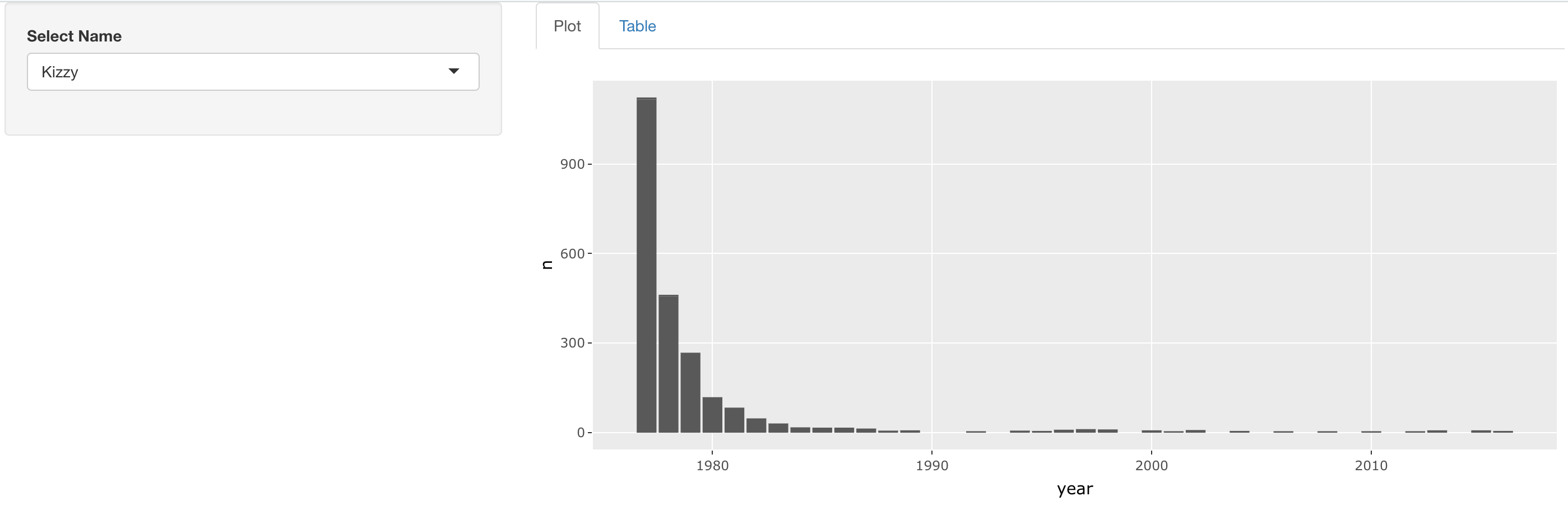
完成したアプリは、次のような見た目になります。
この演習はコースの一部です
Rで作るShiny Webアプリケーション
演習の手順
- このアプリのレイアウトを変更し、名前セレクターはサイドバーに、プロットとテーブルは右側のメインパネルで別々のタブとして表示されるようにしてください。タブにラベルを付けるのも忘れないでください。
実践的なインタラクティブ演習
このサンプルコードを完成させて、この演習に挑戦してみましょう。
ui <- fluidPage(
  sidebarLayout(
    sidebarPanel(
      selectInput('name', 'Select Name', top_trendy_names$name)
    ),
    mainPanel(
      # MODIFY CODE BLOCK BELOW: Wrap in a tabsetPanel
        # MODIFY CODE BELOW: Wrap in a tabPanel providing an appropriate label
        plotly::plotlyOutput('plot_trendy_names'),
        # MODIFY CODE BELOW: Wrap in a tabPanel providing an appropriate label
        DT::DTOutput('table_trendy_names')
    )
  )
)

server <- function(input, output, session){
  # Function to plot trends in a name
  plot_trends <- function(){
     babynames %>%
      filter(name == input$name) %>%
      ggplot(aes(x = year, y = n)) +
      geom_col()
  }
  output$plot_trendy_names <- plotly::renderPlotly({
    plot_trends()
  })

  output$table_trendy_names <- DT::renderDT({
    babynames %>%
      filter(name == input$name)
  })
}

shinyApp(ui = ui, server = server)