Compara los datos filtrados con las lecturas en bruto
Vamos a ver más de cerca la diferencia que produce el filtrado de lecturas. Aquí tienes un gráfico con tres pistas de cobertura. De arriba abajo muestran la cobertura total, la cobertura de alineaciones de alta calidad y la cobertura de alineaciones de baja calidad.
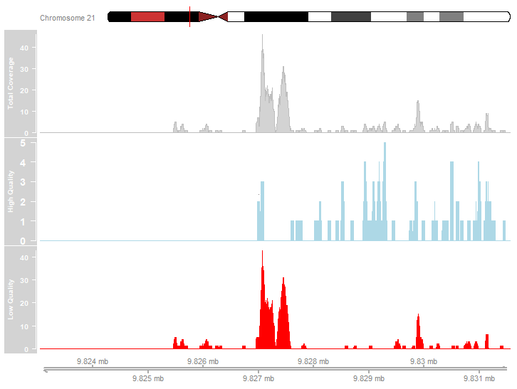
Examina el gráfico de arriba. ¿Cuál de las siguientes afirmaciones describe con precisión los datos de cobertura representados?
- La mayoría de las alineaciones de lecturas eran de alta calidad.
- Los picos más marcados se deben a alineaciones de baja calidad.
- Hay picos en el perfil de cobertura de alta calidad.
Este ejercicio forma parte del curso
ChIP-seq con Bioconductor en R
ejercicio interactivo práctico
Convierte la teoría en práctica con uno de nuestros ejercicios interactivos
 Empezar ejercicio