stripplot() and swarmplot()
Many datasets have categorical data and Seaborn supports several useful plot types for this data. In this example, we will continue to look at the 2010 School Improvement data and segment the data by the types of school improvement models used.
As a refresher, here is the KDE distribution of the Award Amounts:
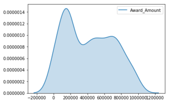
While this plot is useful, there is a lot more we can learn by looking at the individual Award_Amount and how
the amounts are distributed among the four categories.
Deze oefening maakt deel uit van de cursus
Intermediate Data Visualization with Seaborn
Interactieve oefening met praktijkervaring
Probeer deze oefening door deze voorbeeldcode aan te vullen.
# Create the stripplot
sns.____(data=df,
         x='____',
         y='____',
         jitter=____)

plt.show()