选项卡布局
在同一页面展示多张表格和多幅图形,容易造成视觉混乱,影响应用的使用体验。在这种情况下,选项卡布局就很实用,它可以将不同的输出放在各自的选项卡中显示。
本练习将从上一个练习的带侧边栏布局的 Shiny 应用出发,并将其修改为使用选项卡。通过这个练习,您也会看到:只需对代码做少量修改,就能轻松切换 Shiny 应用的页面布局。
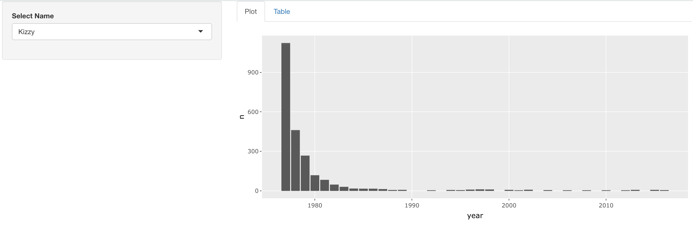
最终的应用应大致如下所示:
本练习是课程的一部分
使用 R 构建 Shiny Web 应用
练习说明
- 修改此应用的布局,使名字选择器出现在侧边栏,图形和表格在右侧作为两个独立的选项卡显示。别忘了给选项卡添加标签!
交互式实操练习
通过完成这段示例代码来试试这个练习。
ui <- fluidPage(
  sidebarLayout(
    sidebarPanel(
      selectInput('name', 'Select Name', top_trendy_names$name)
    ),
    mainPanel(
      # MODIFY CODE BLOCK BELOW: Wrap in a tabsetPanel
        # MODIFY CODE BELOW: Wrap in a tabPanel providing an appropriate label
        plotly::plotlyOutput('plot_trendy_names'),
        # MODIFY CODE BELOW: Wrap in a tabPanel providing an appropriate label
        DT::DTOutput('table_trendy_names')
    )
  )
)

server <- function(input, output, session){
  # Function to plot trends in a name
  plot_trends <- function(){
     babynames %>%
      filter(name == input$name) %>%
      ggplot(aes(x = year, y = n)) +
      geom_col()
  }
  output$plot_trendy_names <- plotly::renderPlotly({
    plot_trends()
  })

  output$table_trendy_names <- DT::renderDT({
    babynames %>%
      filter(name == input$name)
  })
}

shinyApp(ui = ui, server = server)