探索菜系:代表性食材(进阶)
每种菜系之所以独特,往往源于少数几种具有代表性的食材。若只看最常见的食材,我们会被像盐或糖这样的"基础配料"所主导,难以看出差异。
一个有助于识别这些代表性食材的指标是词频-逆文档频率(TFIDF)。它是一种数值统计量,用于衡量某个词(食材)在某份文档(菜系)相对于整个文档集合(配方)的重要性。
我们已为您预先计算了 tf_idf,并创建了名为 recipes_enriched 的增强数据集。您的目标是创建一个 Shiny 应用,根据 tf_idf 显示某个菜系中最具代表性的食材的横向条形图。
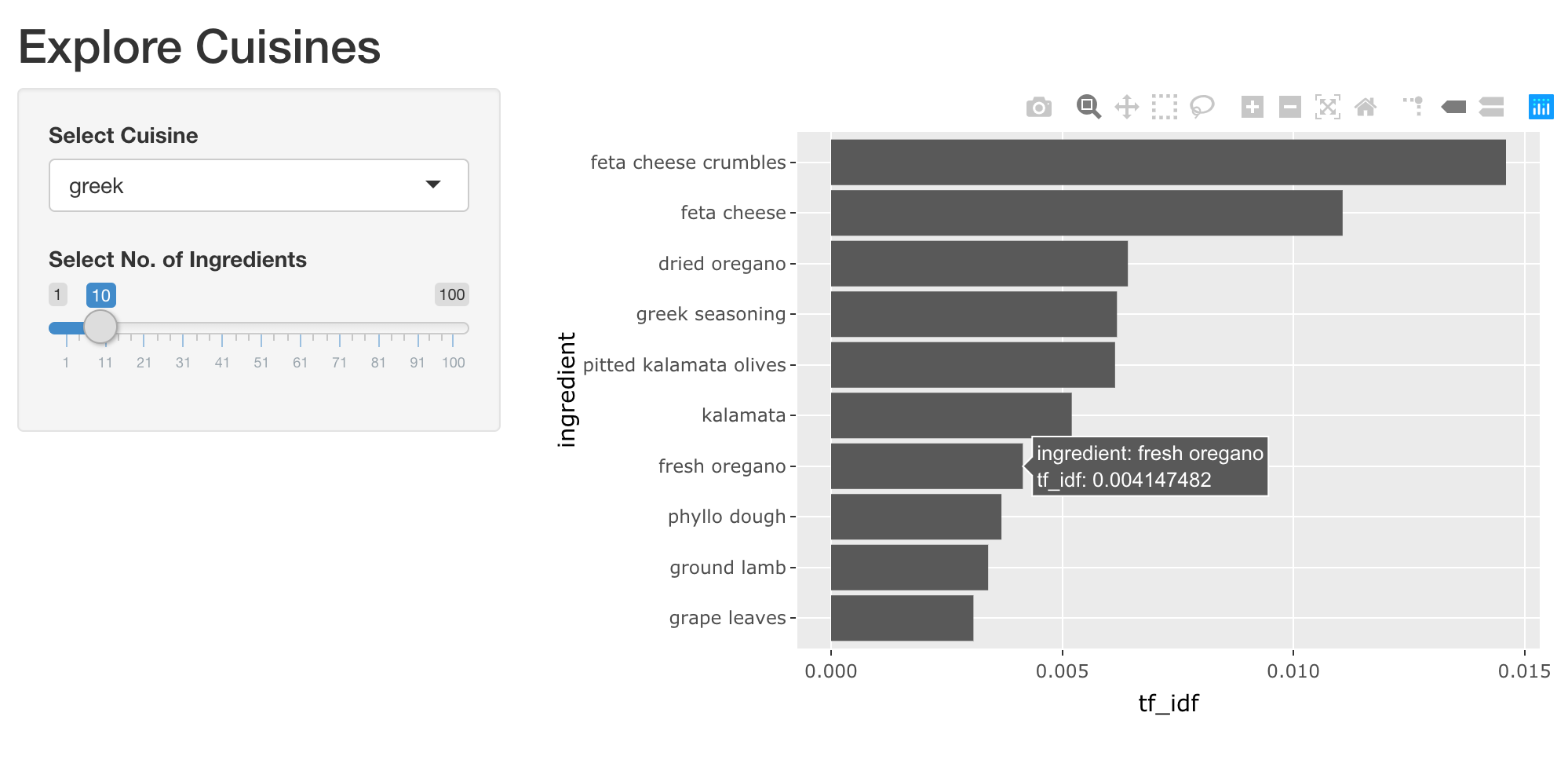
您将使用一个响应式表达式来封装计算逻辑,使绘图代码只专注于生成图形。这是良好的编程实践,有助于构建模块化且高性能的 Shiny 应用。
我们已加载 shiny、dplyr、ggplot2 和 plotly 包。下面提供两段便捷代码片段,用于按菜系筛选代表性食材并创建横向条形图。您可以按需修改。
top_ingredients <- recipes_enriched %>%
  filter(cuisine == 'greek') %>%
  arrange(desc(tf_idf)) %>%
  head(5)

ggplot(top_ingredients, aes(x = ingredient, y = tf_idf)) +
  geom_col() +
  coord_flip()
本练习是课程的一部分
使用 R 构建 Shiny Web 应用
练习说明
UI:
- 添加一个名为
plot_top_ingredients的 Plotly 交互式输出,并将其包裹在带有合适标签的tabPanel()中。
- 添加一个名为
Server:
- 添加一个名为
rval_top_ingredients的响应式表达式, 基于所选菜系筛选recipes_enriched,并按tf_idf取最具代表性的食材。 - 渲染一个显示代表性食材及其
tf_idf的交互式条形图, 并将其赋值给名为plot_top_ingredients的输出。 进阶挑战:尝试让条形按tf_idf的降序显示。
- 添加一个名为
交互式实操练习
通过完成这段示例代码来试试这个练习。
ui <- fluidPage(
  titlePanel('Explore Cuisines'),
  sidebarLayout(
    sidebarPanel(
      selectInput('cuisine', 'Select Cuisine', unique(recipes$cuisine)),
      sliderInput('nb_ingredients', 'Select No. of Ingredients', 1, 100, 10),
    ),
    mainPanel(
      tabsetPanel(
        # CODE BELOW: Add a plotly output named "plot_top_ingredients"

        tabPanel('Table', DT::DTOutput('dt_top_ingredients'))
      )
    )
  )
)

server <- function(input, output, session) {
  # CODE BELOW: Add a reactive expression named `rval_top_ingredients` that
  # filters `recipes_enriched` for the selected cuisine and top ingredients
  # based on the tf_idf value.


  # CODE BELOW: Render a horizontal bar plot of top ingredients and
  # the tf_idf of recipes they get used in, and assign it to an output named
  # `plot_top_ingredients`


  output$dt_top_ingredients <- DT::renderDT({
    recipes %>%
      filter(cuisine == input$cuisine) %>%
      count(ingredient, name = 'nb_recipes') %>%
      arrange(desc(nb_recipes)) %>%
      head(input$nb_ingredients)
  })
}

shinyApp(ui, server)