自訂連續色盤
你想要查看 2014 年辛辛那提的污染程度。你特別關心 CO 和 NO2,因此先畫一張簡單的散佈圖來呈現兩種污染物之間的關係。
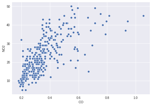
不過,O3 的數值和這兩種污染物之間的關係可能也有一些有趣的資訊,所以你決定依照 O3 的濃度來為點著色。為了達成這點,你需要定義一個合適的連續色盤,並在散佈圖中將 O3 欄位對應到該色盤。
本練習屬於課程
用 Python 改善你的資料視覺化
練習說明
- 建立一個從白色連續過渡到
'orangered'的色盤。 - 將
O3數值的欄位對應到點的顏色。 - 將你建立的色盤傳入繪圖函式。
動手互動練習
試著完成這個範例程式碼,體驗一下這個練習。
# Filter the data
cinci_2014 = pollution.query("city  ==  'Cincinnati' & year  ==  2014")

# Define a custom continuous color palette
color_palette = sns.____('orangered',
                         ____ = True)

# Plot mapping the color of the points with custom palette
sns.scatterplot(x = 'CO',
                y = 'NO2',
                ____ = 'O3',
                data = cinci_2014,
                palette = ____)
plt.show()