用顏色編碼選對變數
你要視覺化 Long Beach 與附近城市的汙染值隨時間變化。提供的程式碼會產生下圖(不易閱讀的圖),內容是以城市作為顏色填滿的長條圖,顯示最大汙染值(變數為 max_pollutant_values)。
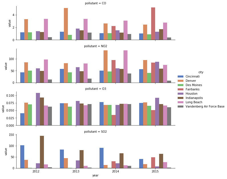
你可以用幾個小調整快速改善。先將顯示的城市改為僅包含位於美國西半部的城市,以減少雜訊。接著,把顏色編碼從 city 改成 year,就能使用序列型(ordinal)調色盤,讀者就不必一直對照圖例來確認每個顏色對應到哪個城市。
本練習屬於課程
用 Python 改善你的資料視覺化
練習說明
- 從
cities向量中移除'Indianapolis'、'Des Moines'、'Cincinnati'、'Houston'。 - 交換
city與year兩個變數的編碼。 - 使用
'BuGn'的 ColorBrewer 調色盤,為新的序列型變數對應合適的顏色。
動手互動練習
試著完成這個範例程式碼,體驗一下這個練習。
# Reduce to just cities in the western half of US
cities = ['Fairbanks', 'Long Beach', 'Vandenberg Air Force Base', 'Denver',
          'Indianapolis', 'Des Moines', 'Cincinnati', 'Houston']

# Filter data to desired cities
city_maxes = max_pollutant_values[max_pollutant_values.city.isin(cities)]

# Swap city and year encodings
sns.catplot(x = 'year', hue = 'city',
              y = 'value', row = 'pollutant',
              # Change palette to one appropriate for ordinal categories
              data = city_maxes, palette = 'muted',
              sharey = False, kind = 'bar')
plt.show()