Unraveling campaign performance
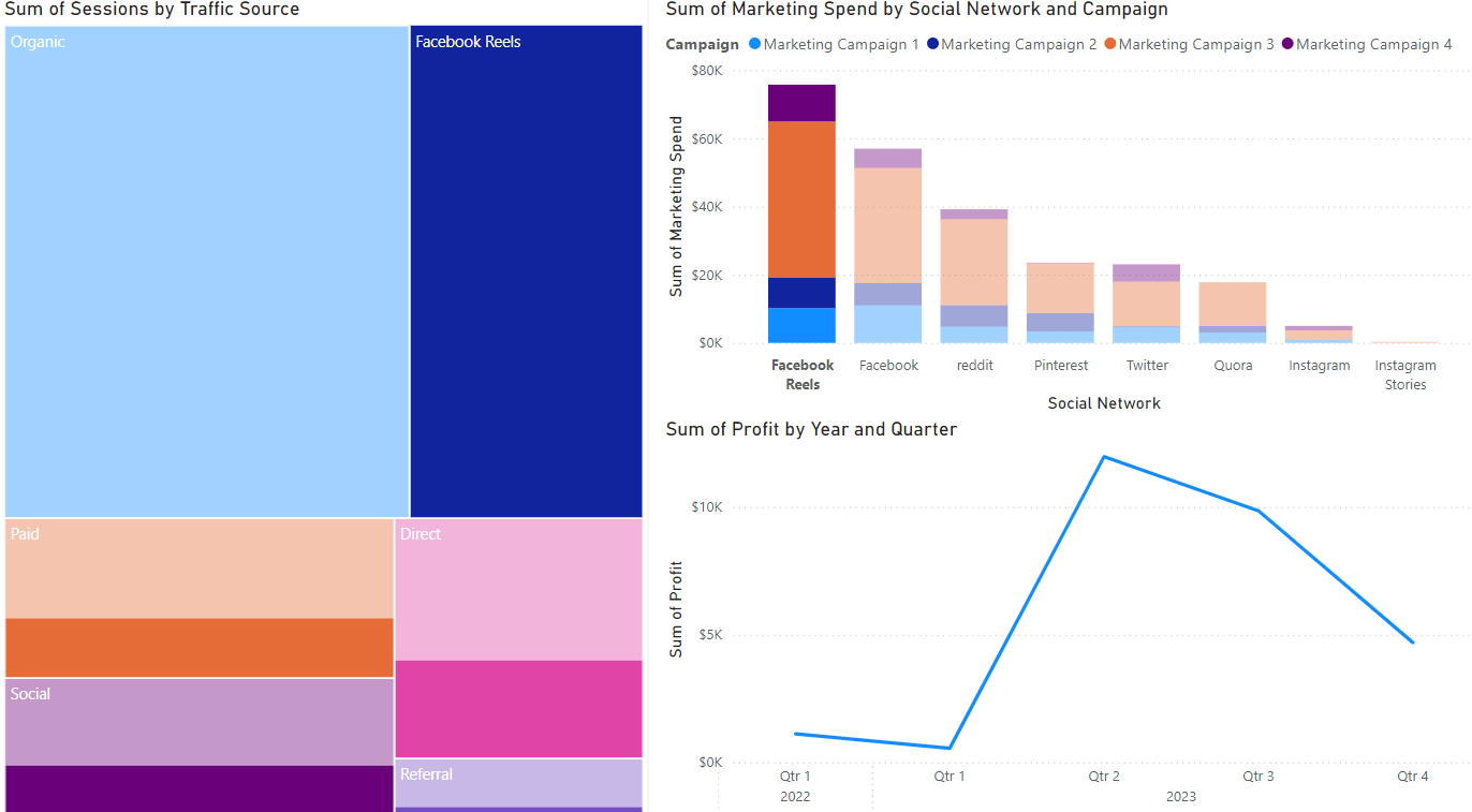
Campaign analysis time! Let's say you created a tree map (sessions by traffic source), a bar chart (marketing spend by channel), and a line graph (profit). The default view of your report tab is shown below.
Let's use these Power BI visualizations to dissect most profitable campaign and identify optimization opportunities.
This exercise is part of the course
Power BI for End Users
Hands-on interactive exercise
Turn theory into action with one of our interactive exercises
 Start Exercise