为颜色选择合适的变量进行编码
您的任务是可视化 Long Beach 及周边城市的污染值随时间的变化。提供的代码生成了下方这个(难以阅读的图),其中包含按城市着色的最大污染值(存于 max_pollutant_values)。
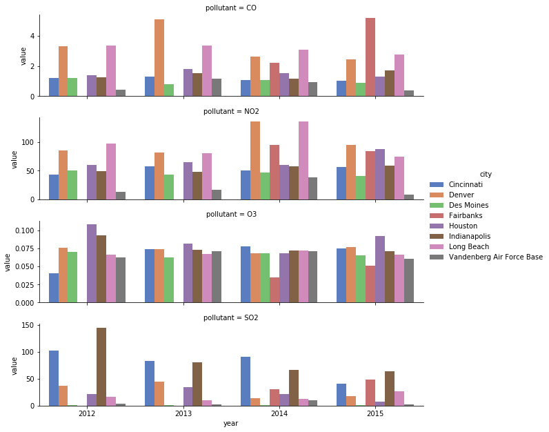
您可以通过一些小改动快速改进它。首先,将展示的城市限制为仅包含美国西部的城市,以减少杂乱。接着,将颜色编码从 city 切换为 year,这样就能使用序数调色板,读者就不必不断查看图例来确认颜色对应的城市。
本练习是课程的一部分
用 Python 提升数据可视化
练习说明
- 从
cities向量中移除'Indianapolis'、'Des Moines'、'Cincinnati'、'Houston'。 - 交换
city和year变量的编码。 - 使用
'BuGn'ColorBrewer 调色板,为新的序数变量进行合适的颜色映射。
交互式实操练习
通过完成这段示例代码来试试这个练习。
# Reduce to just cities in the western half of US
cities = ['Fairbanks', 'Long Beach', 'Vandenberg Air Force Base', 'Denver',
          'Indianapolis', 'Des Moines', 'Cincinnati', 'Houston']

# Filter data to desired cities
city_maxes = max_pollutant_values[max_pollutant_values.city.isin(cities)]

# Swap city and year encodings
sns.catplot(x = 'year', hue = 'city',
              y = 'value', row = 'pollutant',
              # Change palette to one appropriate for ordinal categories
              data = city_maxes, palette = 'muted',
              sharey = False, kind = 'bar')
plt.show()