การสร้างกราฟแบบ facet grid
ในแบบฝึกหัดที่แล้ว คุณได้เขียนโค้ดต่อไปนี้:
# Subset tech and fmcg companies
subset_dat = dataset.loc[dataset["comp_type"].isin(["tech", "fmcg"])]

# Compute yearly average gross margin ratio of tech and fmcg companies
subset_dat_avg = subset_dat.pivot_table(index=["Year", "comp_type"], values = "gross_margin").reset_index()

#Add column company
subset_dat_avg["company"] = np.where(subset_dat_avg["comp_type"]=="tech", "Avg tech", "Avg fmcg")

#Concat the DataFrames
plot_df = pd.concat([subset_dat, subset_dat_avg], axis=0)
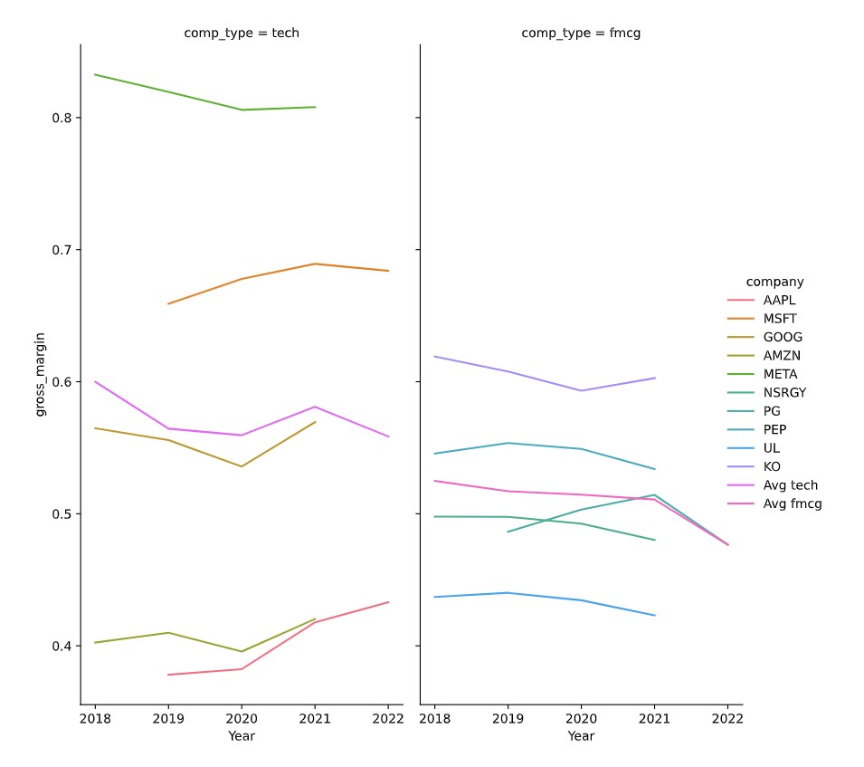
โค้ดดังกล่าวเตรียมข้อมูลสำหรับสร้างกราฟต่อไปนี้:
ถึงเวลาสร้างกราฟแล้ว
แบบฝึกหัดนี้เป็นส่วนหนึ่งของหลักสูตร
การวิเคราะห์งบการเงินด้วย Python
คำแนะนำการฝึกหัด
- ใช้ DataFrame
plot_dfเพื่อสร้างกราฟแบบ facet grid ตามที่อธิบายไว้ในโจทย์ โดยใช้seaborn
แบบฝึกหัดเชิงโต้ตอบแบบลงมือทำ
ลองทำแบบฝึกหัดนี้โดยเติมโค้ดตัวอย่างนี้ให้สมบูรณ์
# Make the plot
sns.relplot(data=plot_df.reset_index(drop=True), ____)
plt.show()
plt.close()