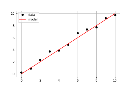
Plotting the Model on the Data
Continuing with the same measured data from the previous exercise, your goal is to use a predefined model() and measured data times and measured_distances to compute modeled distances, and then plot both measured and modeled data on the same axis.
Este exercicio faz parte do curso
Introduction to Linear Modeling in Python
Instruções do exercicio
- Use
model_distances = model(times, measured_distances)to compute the modeled values. - Use
plt.subplots()to create figure and axis objects. - Use
axis.plot()to plottimesvsmeasured_distanceswith optionslinestyle=" ", marker="o", color="black". - Use
axis.plot()to also plottimesvsmodel_distanceswith optionslinestyle="-", color="red".
exercicio interativo prático
Tente este exercicio completando este código de exemplo.
# Pass times and measured distances into model
model_distances = model(____, ____)

# Create figure and axis objects and call axis.plot() twice to plot data and model distances versus times
fig, axis = plt.subplots()
axis.plot(____, ____, linestyle="____", marker="____", color="____", label="Measured")
axis.plot(____, ____, linestyle="____", marker=None, color="____", label="Modeled")

# Add grid lines and a legend to your plot, and then show to display
axis.grid(True)
axis.legend(loc="best")
plt.show()