Créer un graphique en grille de facettes
Dans l’exercice précédent, vous avez écrit le code suivant :
# Subset tech and fmcg companies
subset_dat = dataset.loc[dataset["comp_type"].isin(["tech", "fmcg"])]

# Compute yearly average gross margin ratio of tech and fmcg companies
subset_dat_avg = subset_dat.pivot_table(index=["Year", "comp_type"], values = "gross_margin").reset_index()

#Add column company
subset_dat_avg["company"] = np.where(subset_dat_avg["comp_type"]=="tech", "Avg tech", "Avg fmcg")

#Concat the DataFrames
plot_df = pd.concat([subset_dat, subset_dat_avg], axis=0)
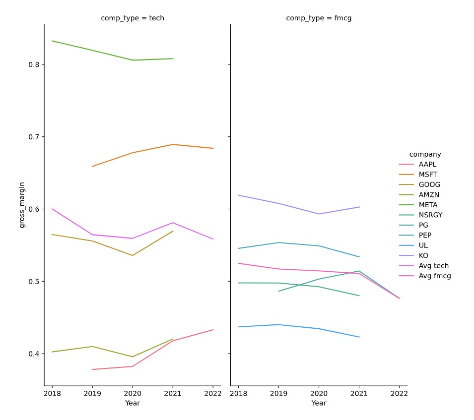
Ce code a préparé les données pour produire le graphique suivant :
Il est maintenant temps de tracer le graphique.
Cet exercice fait partie du cours
<cours>Analyser les états financiers en Python</cours>Instructions de l’exercice
- Utilisez le DataFrame
plot_dfpour créer le graphique en grille de facettes décrit, en utilisantseaborn.
Exercice interactif pratique
Essayez cet exercice en complétant ce code d’exemple.
# Make the plot
sns.relplot(data=plot_df.reset_index(drop=True), ____)
plt.show()
plt.close()