Crear una paleta continua personalizada
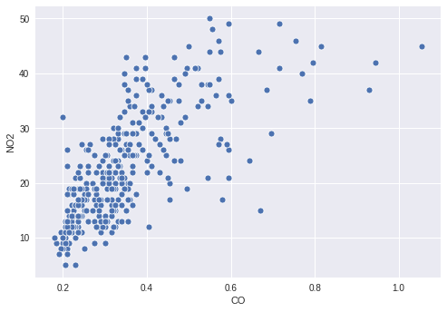
Te interesan los niveles de contaminación de Cincinnati en el año 2014. En concreto, te interesan el CO y el NO2, así que haces un diagrama de dispersión sencillo para mostrar la relación entre ambos contaminantes.
Sin embargo, puede haber información interesante en cómo se relaciona el valor de O3 con los dos contaminantes representados, por lo que decides colorear los puntos según sus niveles de O3. Para ello, necesitas definir una paleta continua adecuada y mapear tu columna O3 a esa paleta en tu diagrama de dispersión.
Este ejercicio forma parte del curso
Mejora tus visualizaciones de datos en Python
Instrucciones del ejercicio
- Crea una paleta que haga un mapeo continuo desde blanco hasta
'orangered'. - Mapea la columna de valores
O3al color de los puntos. - Pasa la paleta que creaste a la función de graficado.
ejercicio interactivo práctico
Prueba este ejercicio completando este código de ejemplo.
# Filter the data
cinci_2014 = pollution.query("city  ==  'Cincinnati' & year  ==  2014")

# Define a custom continuous color palette
color_palette = sns.____('orangered',
                         ____ = True)

# Plot mapping the color of the points with custom palette
sns.scatterplot(x = 'CO',
                y = 'NO2',
                ____ = 'O3',
                data = cinci_2014,
                palette = ____)
plt.show()