Arreglando los gráficos de barras de Seaborn
Los valores predeterminados de Seaborn para los colores de las barras en un gráfico de barras no son ideales para una percepción precisa. Al dibujar cada barra de un color distinto, existe el riesgo de que quien lo vea perciba dos barras del mismo tamaño como diferentes, ya que solemos ver algunos colores como “más grandes” que otros.
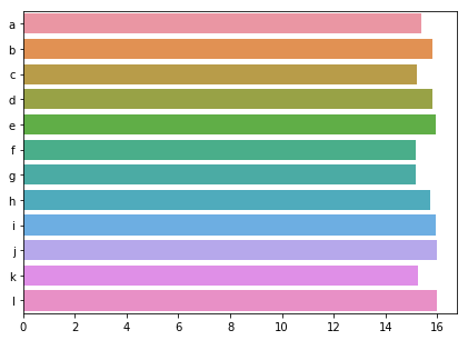
Comentamos dos formas sencillas de corregir esto. Primero, poniendo un borde alrededor de las barras; segundo, cambiando todas las barras al mismo color. Prueba ambas soluciones con nuestros datos de contaminación.
Este ejercicio forma parte del curso
Mejora tus visualizaciones de datos en Python
ejercicio interactivo práctico
Prueba este ejercicio completando este código de ejemplo.
import numpy as np

sns.barplot(y = 'city', x = 'CO',
            estimator = np.mean,
            ci = False,
            data = pollution,
            # Add a border to the bars
            ____ = ____)
plt.show()