Do these samples look the same to you?
Examining PCA plots allows you to get a sense of similarities and differences between samples on a global scale. Using the output generated during sample QC it is straightforward to generate PCA plots of the processed data. Below is a plot for all four samples that passed QC.
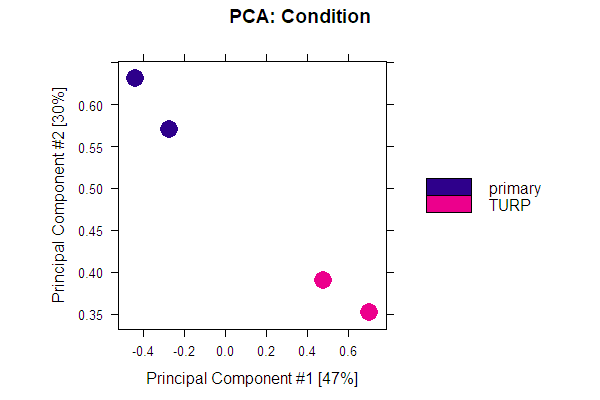
Examine the plot and then consider the following statements. Which ones are true?
- The samples cluster by condition.
- A plot like this can be created with the
plotPrincomp()function. - Using a PCA plot it is easy to see which peaks differ the most between groups.
This exercise is part of the course
ChIP-seq with Bioconductor in R
Hands-on interactive exercise
Turn theory into action with one of our interactive exercises
 Start Exercise