Plotting the Model on the Data
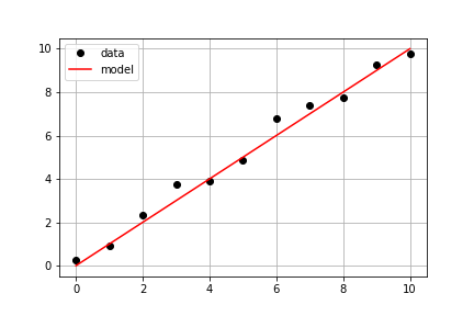
Continuing with the same measured data from the previous exercise, your goal is to use a predefined model() and measured data times and measured_distances to compute modeled distances, and then plot both measured and modeled data on the same axis.
Bu egzersiz, kursun bir parçasıdır
Introduction to Linear Modeling in Python
Egzersiz talimatları
- Use
model_distances = model(times, measured_distances)to compute the modeled values. - Use
plt.subplots()to create figure and axis objects. - Use
axis.plot()to plottimesvsmeasured_distanceswith optionslinestyle=" ", marker="o", color="black". - Use
axis.plot()to also plottimesvsmodel_distanceswith optionslinestyle="-", color="red".
Uygulamalı etkileşimli egzersiz
Bu egzersizi bu örnek kodu tamamlayarak deneyin.
# Pass times and measured distances into model
model_distances = model(____, ____)

# Create figure and axis objects and call axis.plot() twice to plot data and model distances versus times
fig, axis = plt.subplots()
axis.plot(____, ____, linestyle="____", marker="____", color="____", label="Measured")
axis.plot(____, ____, linestyle="____", marker=None, color="____", label="Modeled")

# Add grid lines and a legend to your plot, and then show to display
axis.grid(True)
axis.legend(loc="best")
plt.show()