Criando um facet grid plot
No exercício anterior, você escreveu o seguinte código:
# Subconjuntos de empresas de tecnologia e bens de consumo (FMCG)
subset_dat = dataset.loc[dataset["comp_type"].isin(["tech", "fmcg"])]

# Calcular a média anual da margem bruta das empresas de tech e fmcg
subset_dat_avg = subset_dat.pivot_table(index=["Year", "comp_type"], values = "gross_margin").reset_index()

# Adicionar coluna company
subset_dat_avg["company"] = np.where(subset_dat_avg["comp_type"]=="tech", "Avg tech", "Avg fmcg")

# Concatenar os DataFrames
plot_df = pd.concat([subset_dat, subset_dat_avg], axis=0)
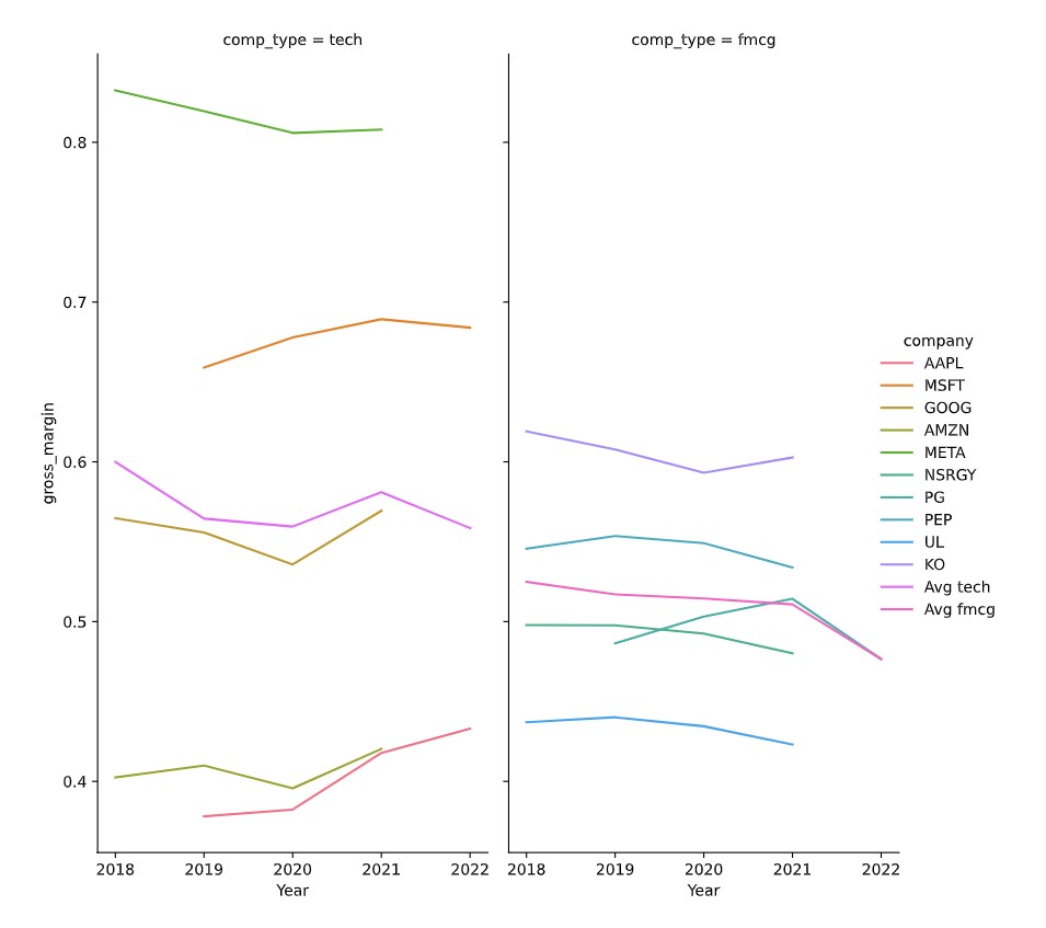
Esse código preparou os dados para criar o seguinte gráfico:
Agora é hora de criar o gráfico.
Este exercicio faz parte do curso
Análise de Demonstrativos Financeiros em Python
Instruções do exercicio
- Use o DataFrame
plot_dfpara criar o facet grid plot descrito usando oseaborn.
exercicio interativo prático
Tente este exercicio completando este código de exemplo.
# Make the plot
sns.relplot(data=plot_df.reset_index(drop=True), ____)
plt.show()
plt.close()