Lijngrafieken interpreteren
Lijngrafieken zijn ideaal om twee continue variabelen te vergelijken, waarbij opeenvolgende observaties op de een of andere manier met elkaar verbonden zijn. Een veelvoorkomend type lijngrafiek heeft datums of tijden op de x-as en een numerieke grootheid op de y-as. In dit geval betekent "opeenvolgende observaties" waarden op opeenvolgende datums, zoals vandaag en morgen. Door meerdere lijnen in dezelfde grafiek te tekenen, kun je waarden vergelijken.
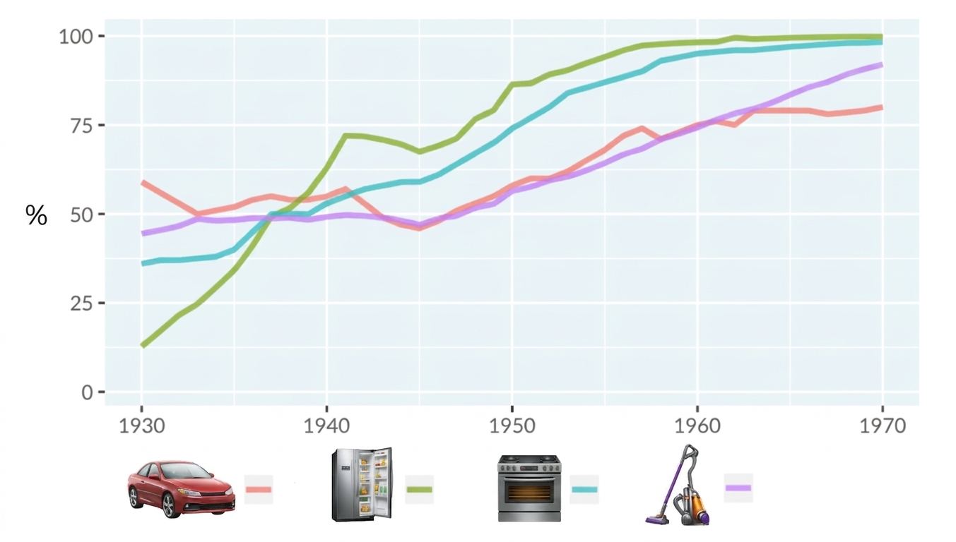
De volgende lijngrafiek laat het percentage huishoudens in de Verenigde Staten zien dat elk van vier technologieën (auto’s, koelkasten, fornuizen en stofzuigers) tussen 1930 en 1970 heeft overgenomen. De x-as geeft de jaren weer en de y-as het percentage adoptie (hoeveel huishoudens een technologie op een bepaald moment hadden overgenomen). Elke gekleurde lijn komt overeen met een andere technologie.
Gegevensbron: Hannah Ritchie and Max Roser (2019) - Technology Adoption
Deze oefening maakt deel uit van de cursus
Datavisualisatie begrijpen
Interactieve oefening met praktijkervaring
Zet theorie om in actie met een van onze interactieve oefeningen
 Begin oefening