Dotplots interpreteren
Dotplots lijken op staafdiagrammen doordat ze een numerieke maat tonen voor elke categorie van een categorische variabele. Ze hebben twee voordelen ten opzichte van staafdiagrammen: je kunt een logaritmische schaal gebruiken voor de maat, en je kunt meer dan één maat per categorie weergeven.
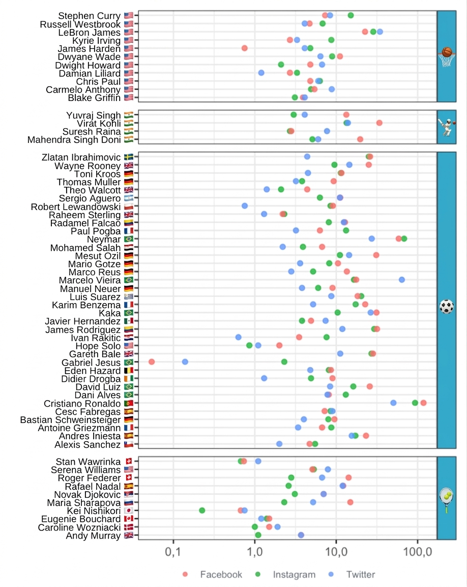
Hier zie je een dotplot van de socialmedia-volgers van de ESPN 2017 top 100 beroemdste atleten, met één rij per atleet. Voor elke atleet worden drie maten getoond: het aantal volgers op Facebook, Instagram en Twitter. Alleen de atleten in Basketball, Cricket, Soccer en Tennis die op elk platform een account hadden, worden getoond. De rijen zijn per sport alfabetisch gesorteerd.
Op basis van de plot: welke uitspraak over de socialmedia-volgers van de atleet is onwaar?
Deze oefening maakt deel uit van de cursus
Datavisualisatie begrijpen
Interactieve oefening met praktijkervaring
Zet theorie om in actie met een van onze interactieve oefeningen
 Begin oefening