Pair plots interpreteren
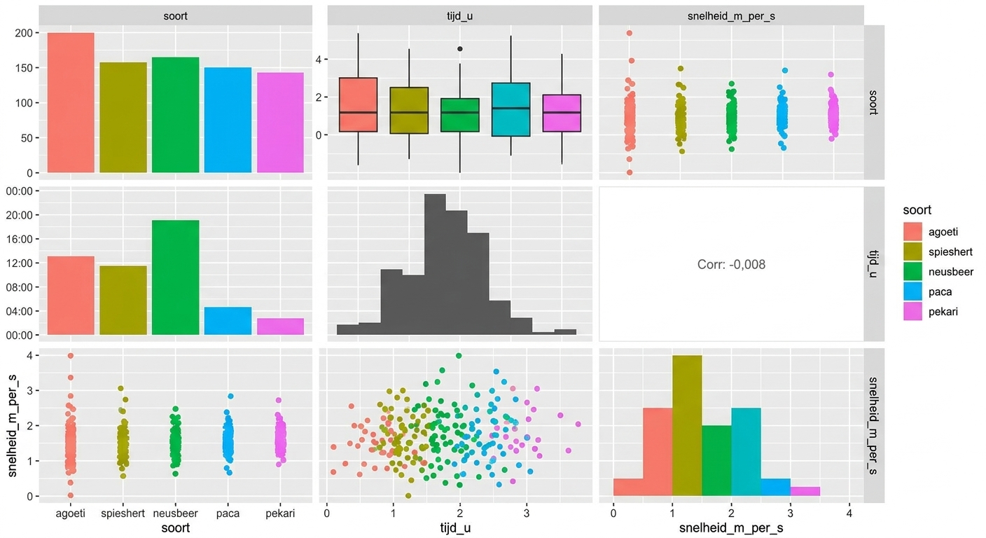
Om snel een overzicht van een gegevensset te krijgen, is het heel handig om zowel de verdeling van elke variabele als de relatie tussen elk variabelenpaar te plotten. Een pair plot toont al deze grafieken samen in een matrix van panelen. Het laat veel informatie tegelijk zien, dus bekijk voor de interpretatie het best één paneel per keer.
Hier zie je de Panamese cameravalgegevens voor de agouti en paca, plus drie nieuwe soorten: coati, brocket en pekari.
Deze oefening maakt deel uit van de cursus
Datavisualisatie begrijpen
Interactieve oefening met praktijkervaring
Zet theorie om in actie met een van onze interactieve oefeningen
 Begin oefening