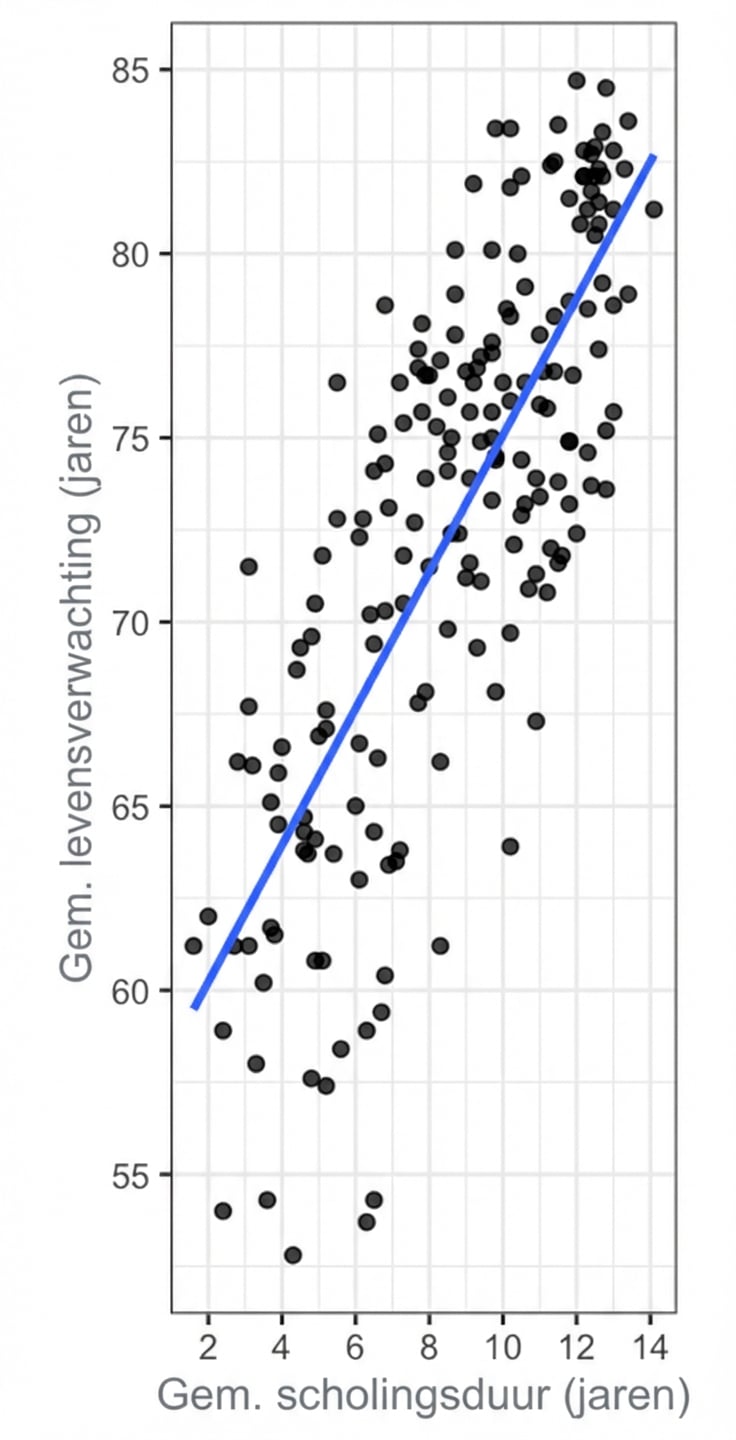
Spreidingsdiagrammen interpreteren
Spreidingsdiagrammen laten je de relatie tussen twee continue variabelen verkennen.
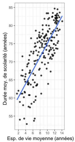
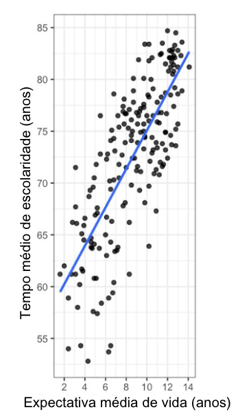
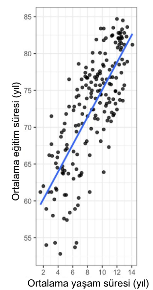
Hier zie je een spreidingsdiagram van de gemiddelde levensverwachting (op de y-as) versus de gemiddelde schoolduur (op de x-as) voor landen over de hele wereld. Elk punt in de plot staat voor één land. Er is een rechte trendlijn uit een lineair regressiemodel weergegeven.
View translated version: IT | DE | ES | FR | PT-BR | TR
Data source: United Nations
Deze oefening maakt deel uit van de cursus
Datavisualisatie begrijpen
Interactieve oefening met praktijkervaring
Zet theorie om in actie met een van onze interactieve oefeningen
 Begin oefening