Rappresentare il modello sui dati
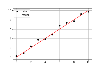
Proseguendo con gli stessi dati misurati dell'esercizio precedente, il tuo obiettivo è usare una model() già definita e i dati misurati times e measured_distances per calcolare le distanze modellate e poi tracciare sia i dati misurati sia quelli modellati sullo stesso asse.
Questo esercizio fa parte del corso
Introduzione alla modellazione lineare in Python
Istruzioni dell'esercizio
- Usa
model_distances = model(times, measured_distances)per calcolare i valori del modello. - Usa
plt.subplots()per creare gli oggetti figura e assi. - Usa
axis.plot()per tracciaretimesvsmeasured_distancescon le opzionilinestyle=" ", marker="o", color="black". - Usa
axis.plot()anche per tracciaretimesvsmodel_distancescon le opzionilinestyle="-", color="red".
esercizio interattivo pratico
Prova questo esercizio completando questo codice di esempio.
# Pass times and measured distances into model
model_distances = model(____, ____)

# Create figure and axis objects and call axis.plot() twice to plot data and model distances versus times
fig, axis = plt.subplots()
axis.plot(____, ____, linestyle="____", marker="____", color="____", label="Measured")
axis.plot(____, ____, linestyle="____", marker=None, color="____", label="Modeled")

# Add grid lines and a legend to your plot, and then show to display
axis.grid(True)
axis.legend(loc="best")
plt.show()