Creare una palette continua personalizzata
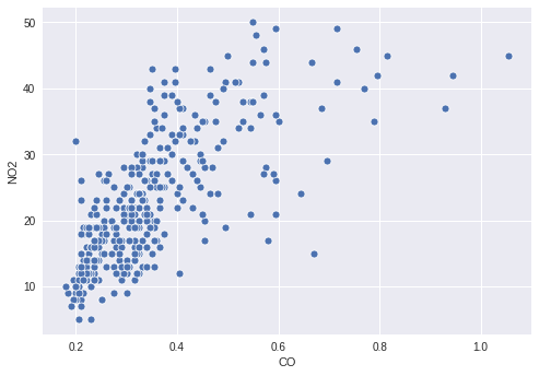
Ti interessano i livelli di inquinamento di Cincinnati per l'anno 2014. In particolare, ti interessano CO e NO2, quindi crei un semplice scatter plot per mostrare la relazione tra i due inquinanti.
Tuttavia, potrebbe esserci qualche informazione interessante nel modo in cui il valore di O3 è legato ai due inquinanti tracciati, quindi decidi di colorare i punti in base ai loro livelli di O3. Per farlo, devi definire una palette continua appropriata e mappare la tua colonna O3 su di essa nel tuo scatter plot.
Questo esercizio fa parte del corso
Migliorare le tue visualizzazioni dei dati in Python
Istruzioni dell'esercizio
- Crea una palette che mappi in modo continuo dal bianco a
'orangered'. - Mappa la colonna dei valori di
O3al colore dei punti. - Passa la palette creata alla funzione di plotting.
esercizio interattivo pratico
Prova questo esercizio completando questo codice di esempio.
# Filter the data
cinci_2014 = pollution.query("city  ==  'Cincinnati' & year  ==  2014")

# Define a custom continuous color palette
color_palette = sns.____('orangered',
                         ____ = True)

# Plot mapping the color of the points with custom palette
sns.scatterplot(x = 'CO',
                y = 'NO2',
                ____ = 'O3',
                data = cinci_2014,
                palette = ____)
plt.show()