Correggere i grafici a barre di Seaborn
I valori predefiniti di Seaborn per i colori delle barre in un grafico a barre non sono l’ideale per una percezione accurata. Usando un colore diverso per ogni barra, c’è il rischio che chi guarda percepisca due barre della stessa altezza come diverse, perché tendiamo a vedere alcuni colori come “più grandi” di altri.
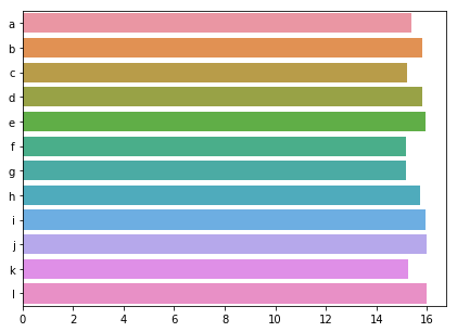
Abbiamo visto due modi semplici per risolvere questo problema. Primo: aggiungere un bordo attorno alle barre; secondo: impostare lo stesso colore per tutte le barre. Prova entrambe le soluzioni sui nostri dati sull’inquinamento.
Questo esercizio fa parte del corso
Migliorare le tue visualizzazioni dei dati in Python
esercizio interattivo pratico
Prova questo esercizio completando questo codice di esempio.
import numpy as np

sns.barplot(y = 'city', x = 'CO',
            estimator = np.mean,
            ci = False,
            data = pollution,
            # Add a border to the bars
            ____ = ____)
plt.show()