Menghapus warna yang tidak perlu
Anda mungkin ingin membandingkan hubungan nilai CO terhadap NO2 di berbagai kota menggunakan scatter plot sederhana dengan warna untuk membedakan data tiap kota.
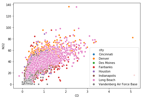
Sayangnya, plot yang dihasilkan sangat rumit. Perbedaan antarkota sulit terlihat karena Anda harus membedakan warna-warna yang mirip. Terkadang, palet warna terbaik untuk plot Anda adalah tanpa warna sama sekali.
Untuk memperbaiki bagan yang sulit dibaca ini, hilangkan komponen warna dan buat facet untuk setiap kota. Meskipun plot yang dihasilkan mungkin tidak terlihat secantik sebelumnya, plot tersebut akan jauh lebih membantu untuk menguraikan perbedaannya.
Latihan ini merupakan bagian dari kursus
Meningkatkan Visualisasi Data Anda di Python
Instruksi latihan
- Untuk menyiapkan bagan yang difaset berdasarkan
city, berikan datapollutionke fungsi plotting, petakancityke kolom, dan buat faset selebar tiga kolom. - Gunakan fungsi
g.map()untuk memetakanscatterplot()pada grid dengan estetika yang sama seperti scatter plot asli tetapi tanpa argumenhue.
Latihan interaktif langsung praktik
Cobalah latihan ini dengan melengkapi kode contoh ini.
# Hard to read scatter of CO and NO2 w/ color mapped to city
# sns.scatterplot('CO', 'NO2',
#                 alpha = 0.2,
#                 hue = 'city',
#                 data = pollution)

# Setup a facet grid to separate the cities apart
g = sns.FacetGrid(data = ____,
                  col = '____',
                  col_wrap = ____)

# Map sns.scatterplot to create separate city scatter plots
g.map(sns.____, 'CO', 'NO2', alpha = 0.2)
plt.show()