Ein FacetGrid-Diagramm erstellen
In der vorherigen Übung hast du den folgenden Code geschrieben:
# Subset tech and fmcg companies
subset_dat = dataset.loc[dataset["comp_type"].isin(["tech", "fmcg"])]

# Compute yearly average gross margin ratio of tech and fmcg companies
subset_dat_avg = subset_dat.pivot_table(index=["Year", "comp_type"], values = "gross_margin").reset_index()

#Add column company
subset_dat_avg["company"] = np.where(subset_dat_avg["comp_type"]=="tech", "Avg tech", "Avg fmcg")

#Concat the DataFrames
plot_df = pd.concat([subset_dat, subset_dat_avg], axis=0)
Der Code hat die Daten vorbereitet, um das folgende Diagramm zu erstellen:
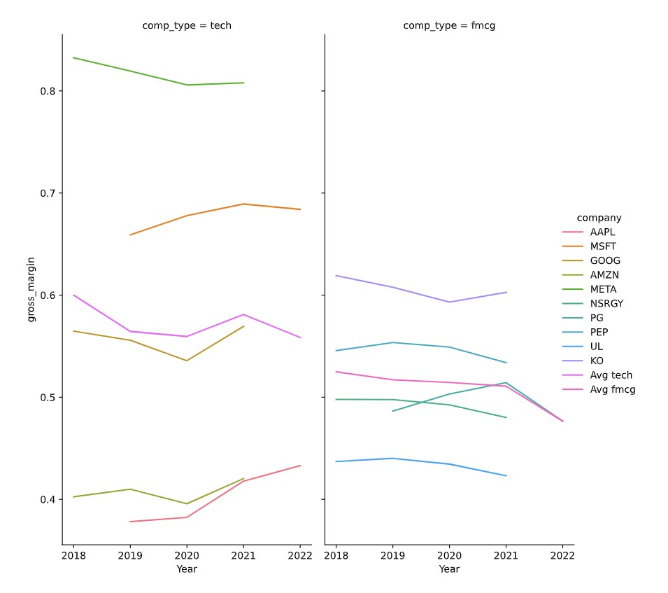
Jetzt ist es Zeit, das Diagramm zu erstellen.
Diese Übung ist Teil des Kurses
<Kurs>Finanzberichte mit Python analysieren</Kurs>Übungsanweisungen
- Verwende den DataFrame
plot_df, um mitseaborndas in der Beschreibung gezeigte FacetGrid-Diagramm zu erstellen.
Interaktive praktische Übung
Versuche dich an dieser Übung, indem du diesen Beispielcode vervollständigst.
# Make the plot
sns.relplot(data=plot_df.reset_index(drop=True), ____)
plt.show()
plt.close()