Plotting the Data
Everything in python is an object, even modules. Your goal in this exercise is to review the use of the object oriented interfaces to the python library matplotlib in order to visualize measured data in a more flexible and extendable work flow. The general plotting work flow looks like this:
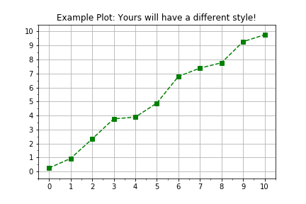
import matplotlib.pyplot as plt
fig, axis = plt.subplots()
axis.plot(x, y, color="green", linestyle="--", marker="s")
plt.show()
This exercise is part of the course
Introduction to Linear Modeling in Python
Exercise instructions
- Use
plt.subplots()to create figure and axis objects. - Data have been provided in two predefined
numpyarrays,timesanddistances. - Use
axis.plot()to plottimeson the horizontal anddistanceson the vertical. - Use the input key word args
linestyle=" ",marker="o", andcolor="red"when callingaxis.plot().
Hands-on interactive exercise
Have a go at this exercise by completing this sample code.
# Create figure and axis objects using subplots()
fig, axis = plt.____()

# Plot line using the axis.plot() method
line = axis.plot(____ , ____ , linestyle="____", marker="____", color="____")

# Use the plt.show() method to display the figure
plt.____()